Satin Canvas Finish Is the Middle Ground That Often Feels Right
A satin canvas finish is a lightly reflective coating that sits between matte restraint and glossy shine. It gives prints more depth and polish than a flat matte surface while avoiding the mirror-like glare that can make high gloss difficult in real rooms. That balance makes satin one of the most practical choices for canvas prints used in homes, offices, galleries, and gift projects. Understanding satin helps buyers choose it for the right reasons rather than treating it as a vague default.
A: It has gentle sheen, but it is not usually mirror-like gloss.
A: It is better when you want more depth while keeping glare moderate.
A: Yes, many photographs suit satin's color depth and restraint.
A: Yes, bright windows and lamps can still reflect at certain angles.
A: A good satin finish should keep canvas weave visible.
A: Durability depends on the coating formula and application quality.
A: Living rooms, bedrooms, offices, and mixed-light spaces often suit it.
A: Yes, especially for large, dark, or important artwork.
A: No, finish names vary across print shops.
A: It balances color richness, subtle polish, and everyday viewability.
Satin Has Sheen Without Becoming Glassy
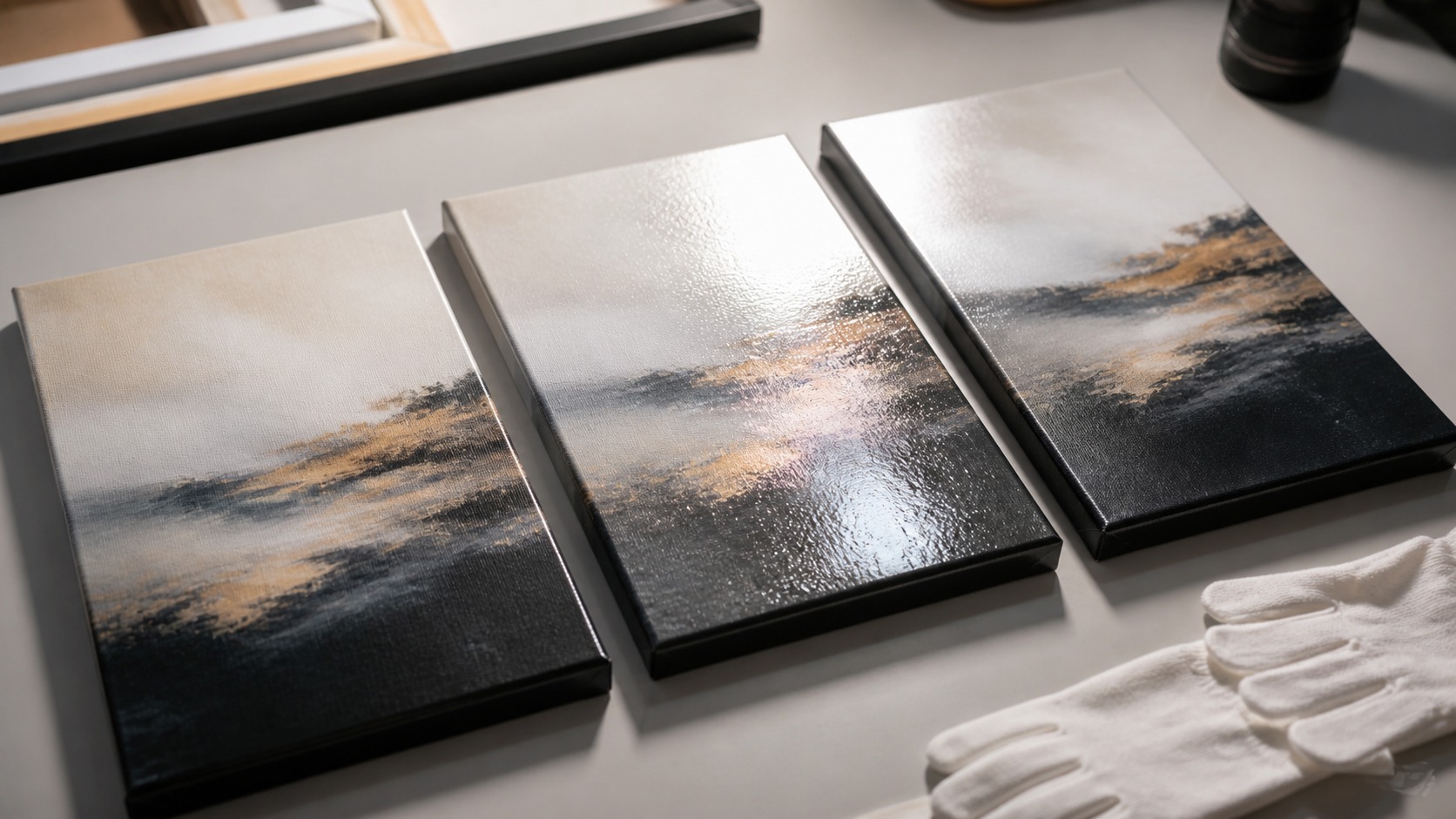
The defining feature of satin is controlled sheen. When light hits the surface, satin gives a gentle glow instead of a hard reflection. The canvas still reads as textured fabric, but color has a little more depth than it would on a very matte coating. That makes the print feel finished without becoming slick.
This middle quality is why satin can be hard to describe online. It is not flat, but it is not shiny in the dramatic sense. The surface changes with angle, room light, and image tone. A satin canvas may look calm from straight on and subtly luminous from the side.
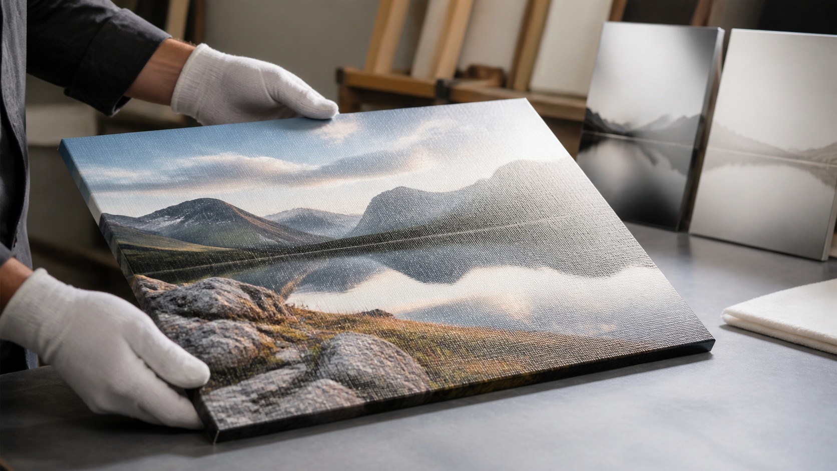
The best satin finish respects the weave. It should not fill the texture so heavily that the canvas loses its tactile identity. Instead, it should coat and protect while letting the fabric character remain visible. That balance is part of why satin feels natural on canvas.
Satin is sometimes described as a practical luxury because it adds refinement without demanding a perfect room. The finish catches enough light to feel alive, then releases attention back to the image. That restraint is valuable on canvas, where texture already contributes visual interest. The coating should enhance, not dominate.
Satin's middle sheen is especially noticeable on wrapped edges. The sides catch light softly, making the canvas feel finished from oblique views. That matters in hallways and rooms where people see the art from the side. A finish is experienced around the object, not only on the front.
Satin also gives the edges of a gallery-wrapped canvas a finished character. When people pass from the side, the surface catches light softly rather than looking raw or overly shiny. That side view matters more than buyers expect. Canvas is an object with depth.
Satin Improves Color Depth Without Heavy Glare
Satin often makes colors look richer than matte. Blacks can feel deeper, midtones gain body, and saturated colors have more presence. At the same time, satin usually avoids the strong window and lamp reflections associated with gloss. It gives the image a lift without turning every light source into a problem.
This is especially helpful for photographs. Family portraits, travel images, landscapes, and fine art photography often need color and detail to feel alive. A flat matte finish can sometimes underplay that energy, while gloss can overstate it. Satin gives many photos a comfortable visual range.
Dark images still need testing. Satin reduces glare compared with gloss, but it can reflect bright shapes if the room lighting is severe. A dark canvas across from a window may still show reflections. Balanced finish works best with balanced placement.
Color transitions can look especially pleasing in satin. Gradients in sky, water, fabric, and skin often gain gentle depth without the hard glare of gloss. That makes satin useful for images with both subtle and saturated areas. It handles complexity gracefully.
For images with water, metal, glass, or evening light, satin can preserve a sense of luminosity. Matte may make those subjects feel quieter than intended, while gloss may overstate reflection. Satin keeps a believable glow. It can make luminous subjects feel natural.
The finish can help midtones especially. Areas that are neither bright highlight nor deep shadow often gain a sense of body under satin coating. That can make landscapes, interiors, and portraits feel more dimensional. The effect is subtle, but it influences the whole print.
A satin finish can also soften the divide between photographic and painterly images. It gives photographs surface richness while letting art reproductions keep a tactile feel. That makes it useful for homes with mixed subjects on the same wall. The finish can quietly unify different kinds of imagery.
Satin Fits Many Real-World Rooms
Homes rarely have perfect gallery lighting. They have windows, lamps, television glow, seasonal sun changes, and furniture that shifts viewing angles. Satin handles those mixed conditions better than many glossy surfaces while feeling more polished than matte. That versatility is its main strength.
In living rooms, satin often looks refined without demanding attention from the decor. In bedrooms, it can keep images soft enough for a restful space while preserving color depth. In offices and reception areas, it can look professional without the harsh glare of gloss. Satin adapts because it is visually flexible.
Large canvas prints also benefit from satin's moderation. A huge glossy surface can become a reflection panel, while a huge matte surface may feel too subdued for some images. Satin keeps large work present without making it difficult to view. Scale is one reason the middle finish is so popular.
The room's style still matters. Rustic, traditional, modern, and transitional interiors can all accept satin, but the degree of sheen should feel natural with nearby materials. A satin canvas near wood, fabric, metal, or stone usually blends well. It has enough polish to feel intentional and enough restraint to feel livable.
Satin also works well when a print may move between rooms. A canvas that starts in a bedroom might later hang in an office or living room. The middle finish is more adaptable than a highly specialized surface. Flexibility can be valuable for gifts and long-term decor.
Satin is also a friendly choice for gifts because the recipient's room may be unknown. A highly matte or highly glossy finish might be perfect in one space and awkward in another. Satin keeps more options open. That flexibility is valuable when the final wall is a surprise.
For offices, satin can reduce the tension between professional polish and practical viewing. Gloss may reflect ceiling lights, while matte may feel too muted in corporate lighting. Satin often looks refined without requiring a redesign of the room. That makes it useful for reception areas and conference rooms.
In hospitality or client-facing rooms, satin can look polished without creating awkward reflections for seated viewers. People may see the canvas from many angles, so extreme gloss can become unpredictable. A moderate surface keeps the image present in changing viewpoints. That makes satin practical beyond private homes.
Satin Is Not the Same as Semi-Gloss Everywhere
Finish names are not perfectly standardized across print shops. One studio's satin may look closer to luster, another may call a similar surface semi-gloss, and another may offer low-gloss protective coating. The name matters less than the actual sample. Buyers should ask to see or describe the sheen level before ordering important work.
The coating formula also matters. A satin finish may include UV protection, moisture resistance, scuff resistance, or simply a visual sheen, depending on the product. Those performance details should be confirmed with the printer. A beautiful finish still needs to be compatible with the ink and canvas.
Application quality affects the final result. Uneven coating, streaks, pooling near edges, or inconsistent sheen can ruin the benefits of satin. The finish should look smooth across the image and clean around wrapped sides. Satin rewards careful production because subtle sheen reveals sloppiness.
Ask whether the satin coating is sprayed, rolled, or otherwise applied. Method can affect smoothness, edge behavior, and consistency across large surfaces. The buyer does not need to become a chemist, but production confidence matters. A good studio can explain its process plainly.
Quality control should include viewing the surface after it is fully dry or cured. Fresh coating can look different from the finished state, and handling too soon can mark it. A professional studio understands that timing. The buyer should not rush approval based on an unfinished surface.
A good satin coating should be even across the entire canvas. Large skies, pale backgrounds, and smooth gradients are where uneven application becomes most visible. Inspect those areas carefully before accepting a finished print. Subtle sheen leaves little room for careless coating.
Use Satin When the Image Needs Both Polish and Restraint
Satin is a strong choice for family photography because it gives faces and clothing enough richness without making skin look glossy. It is also useful for landscapes where water, sky, and shadow need depth but not mirror-like glare. For art reproductions, satin can add a finished quality while keeping brushwork or canvas texture believable. It is a finish for images that need balance.
Choose satin when you are unsure between matte and gloss for a mixed-light room. It will not be as glare-resistant as matte, but it will usually be easier to live with than gloss. It will not be as punchy as high gloss, but it often provides enough richness for daily viewing. That practical middle is often exactly what buyers need.
Avoid satin only when the project clearly asks for an extreme. A very soft, traditional, low-glare piece may prefer matte. A deliberately slick, high-impact commercial display may prefer gloss. When neither extreme is the goal, satin deserves serious consideration.
Satin is often chosen for art that should feel finished but not precious. It gives the owner enough polish for display and enough practicality for everyday rooms. That makes it especially useful for personal photography and decor art. It suits pieces meant to be lived with.
Satin often works when artwork combines personal meaning with decor purpose. It gives the print enough presence to feel special without making it look overly formal. That balance suits family rooms, offices, and bedrooms. The surface feels finished but approachable.
Satin also pairs well with floating frames. The slight sheen gives the print presence inside the frame while the canvas texture keeps it from looking like glass. That combination can feel modern without becoming cold. Finish and framing should be chosen together.
If the image includes very fine texture, ask whether satin will emphasize or soften it. Some surfaces make small detail feel richer, while others draw attention to coating pattern. A sample with the actual image area is the best test. General swatches cannot answer every detail question.
Judge Satin from the Wall, Not the Product Name
The best way to understand satin is to view a sample upright under real light. Flat samples on a table can exaggerate or hide reflections, depending on the angle. A canvas finish lives on a wall, so it should be judged like a wall object. Seeing it upright makes the decision more honest.
Look at the sample from the main seating position, from the side, and with evening lamps on. Notice whether the image stays visible, whether dark areas reflect too much, and whether texture still feels like canvas. Those observations matter more than finish vocabulary. Satin should solve viewing problems, not create new ones.
When chosen well, satin is not a compromise people settle for. It is a finish that respects the image, gives the print presence, and remains comfortable in everyday rooms. That is why it often feels like the perfect balance. It lets the canvas look finished without asking the room to behave perfectly.
If satin feels almost right but slightly too reflective, matte may be better. If it feels too quiet and the room has controlled light, gloss may be worth testing. Satin is the center of the decision, not the end of curiosity. Comparing all three finishes leads to better confidence.
When comparing satin samples, do not judge only the brightest reflection. Also notice how quickly the reflection falls away as you move. A good satin finish should let the image return to view quickly. That behavior is what separates balanced sheen from distracting shine.
The final choice should feel easy to live with, not merely attractive under studio lighting. Satin earns its reputation when the canvas still looks good after the room changes from daylight to evening lamps. That everyday steadiness is the real balance buyers are looking for.