Real Homes Usually Reward the Finish That Behaves Best in the Room
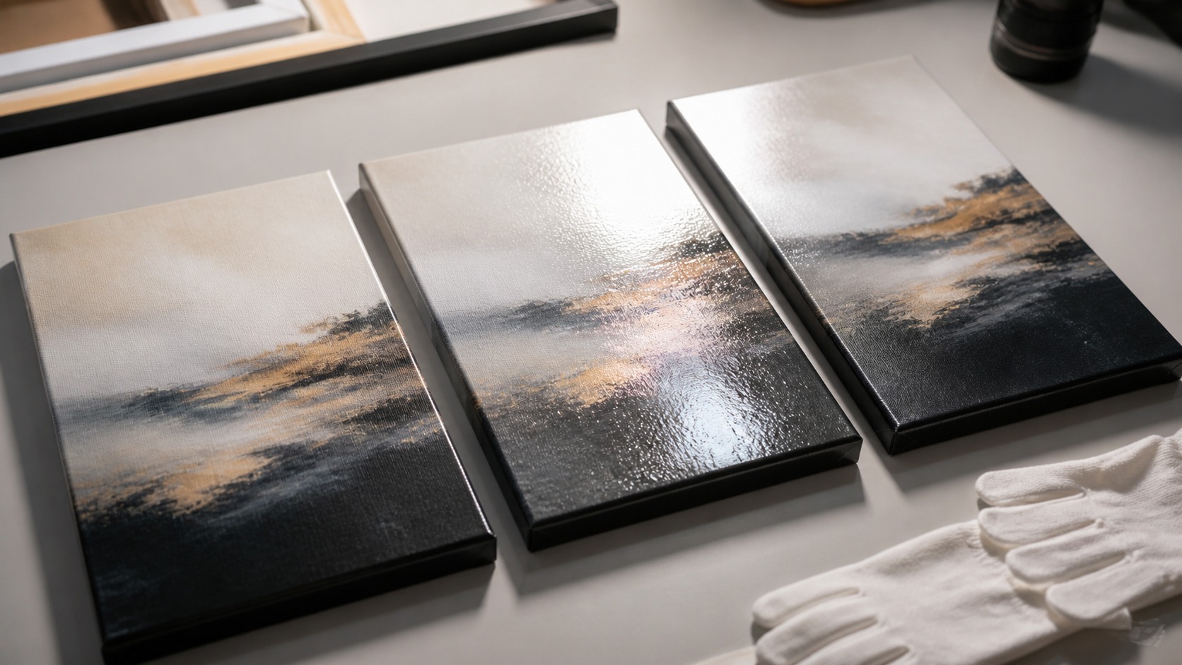
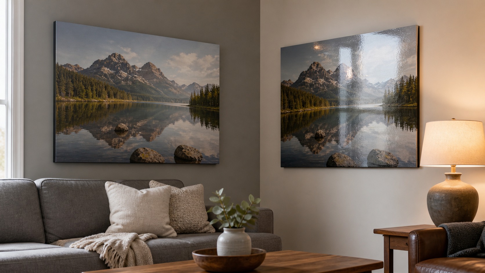
Matte and glossy canvas prints do not compete in a showroom vacuum; they compete with windows, lamps, furniture, wall color, and the way people actually move through a home. Gloss can make an image feel vivid and polished, while matte can make the same image feel calm, soft, and easier to view from more angles. The finish that looks better is usually the one that handles the room's light without fighting the artwork. A real-home decision should consider glare, mood, cleaning, scale, and the emotional tone of the image.
A: Matte often behaves better in bright, mixed-light rooms.
A: Gloss works best with bold images and controlled light.
A: It can soften saturation, but many images benefit from that calm.
A: Not always, but it needs careful placement and lighting.
A: Matte is often more natural for faces and skin tones.
A: Gloss can suit modern rooms if reflections are controlled.
A: Neither should be neglected, but matte often draws less attention to smudges.
A: Only if the room can control large reflection areas.
A: Usually not easily; choose carefully before printing.
A: Bright real home, lean matte; controlled dramatic room, consider gloss.
Matte Looks Better When the Room Is Bright or Layered
Matte canvas has an immediate advantage in rooms with windows or several lamps. Because it reflects less, the artwork remains visible from more positions instead of showing bright rectangles or lamp shapes across the image. That matters in living rooms, bedrooms, hallways, and open-plan spaces where light changes throughout the day. A finish that behaves quietly can make the whole room feel more composed.
Matte also suits homes that lean soft, natural, traditional, or relaxed. It does not announce itself with shine, so the image reads more like a textured art object than a glossy photo product. Muted landscapes, family portraits, botanical art, and painterly reproductions often feel more comfortable with a matte surface. The finish supports atmosphere rather than spectacle.
The limitation is color punch. Matte can make blacks feel a little gentler and bright colors less electric. In a room that already has dim lighting, a matte print may need better placement or more thoughtful illumination. Softness is beautiful when it is intentional, not when it makes the image disappear.
Scale makes matte even more appealing. Large glossy canvases can collect big reflections, while large matte canvases usually stay readable across the room. If the piece is meant to anchor a sofa wall or bedroom, the lower-glare finish often feels more livable. Big art magnifies finish behavior.
Matte can also make a room feel calmer because it does not add another reflective surface. In homes with televisions, windows, mirrors, and lamps, that restraint can be welcome. The artwork contributes color and subject without adding visual noise. Sometimes the best finish is the one that reduces the room's competing shine.
Matte also photographs more predictably in the home. If the canvas will appear in real estate photos, social media, or room portfolio images, lower reflection can be useful. The artwork stays visible without careful camera angles. That practical benefit matters for styled interiors.
Open-plan rooms make the decision harder because the artwork may be viewed from kitchen, sofa, dining table, and hallway positions. Matte usually handles that range more gracefully. Gloss may still work if the print is positioned away from the brightest sight lines. The more angles involved, the more reflection control matters.
Glossy Looks Better When Impact Matters and Light Is Controlled
Glossy canvas can look striking in the right home. It increases the sense of contrast, deepens dark areas, and gives saturated colors a more dramatic presence. For modern interiors, bold abstracts, city scenes, and high-energy photography, gloss can deliver the visual snap people want. It is a finish for impact.
Controlled light is the condition that makes gloss work. If the print hangs away from direct windows and strong lamp reflections, the surface can show off color without interrupting the image. A hallway, media room, studio, or dining area with planned lighting may handle gloss well. Gloss needs cooperation from the room.
In real homes, reflections are the main complaint. A glossy finish may look fantastic from one angle and frustrating from another. A sofa, dining chair, or hallway approach can reveal glare that was not obvious during ordering. The finish should be judged from where people actually stand and sit.
Gloss can also make surface texture feel more pronounced. On canvas, that shine moves over the weave, which can be visually interesting or distracting depending on the image. Detailed photographs may gain crispness, while subtle artwork may feel too slick. Gloss is powerful, but it has a strong personality.
Gloss can be excellent for statement pieces when the wall is deliberately staged. A single dramatic canvas in a controlled corner may benefit from the extra depth and polish. The key is treating gloss as part of the lighting design. It should not be left to chance.
Gloss can create a premium feeling when the image itself is clean and graphic. Strong shapes, controlled shadows, and saturated colors can handle the surface energy. Busy images with many tiny details may become harder to read if glare crosses them. The image structure should be bold enough for the finish.
Gloss can also make a canvas feel more photographic. That can be desirable for crisp travel images, cars, architecture, or modern city scenes. It may be less desirable for artwork that is meant to feel hand-rendered or quietly textured. The finish should support the medium the viewer expects.
Gloss also changes how a room feels at night. Lamps can create bright highlights that are charming in one corner and distracting in another. If the canvas will be viewed mostly after work or dinner, evening testing matters more than daytime theory. Real-home finish decisions should follow real-home hours.
Compare Them by Subject, Not Only by Shine
Portraits often benefit from matte or satin-like restraint because skin can look unnatural under heavy shine. A glossy portrait may exaggerate highlights on faces or make darker areas reflect the room. Matte keeps attention on expression and tone. For family images, that emotional directness often matters more than maximum saturation.
Landscapes can go either way. A misty forest, quiet beach, or soft mountain scene may feel more immersive in matte, while a dramatic sunset, night skyline, or saturated desert scene may enjoy gloss. The image's mood should lead the finish choice. Finish should not force a calm image to shout.
Abstract art depends on color and surface intent. If the piece is about bold color blocks and contemporary energy, gloss can help. If it is about texture, subtle transitions, or a painterly feel, matte may look more refined. The same finish does not flatter every abstract.
Black-and-white work needs special judgment. Gloss can make deep blacks feel rich, but glare across shadow areas can be distracting. Matte can feel timeless and photographic in a quieter way. The best choice depends on whether the image relies on drama or nuance.
Pet portraits, baby photos, and wedding images often reveal the difference quickly. Viewers care about softness, expression, and emotional warmth. If the finish draws attention before the faces do, it is probably too assertive. Real-home art should serve memory as well as color.
Rooms with layered textiles often make matte feel natural. Linen curtains, wool rugs, wood grain, and soft upholstery already create tactile warmth. A glossy canvas can still work, but it may feel like a different design language. Finish should join the room rather than argue with it.
For children's rooms and casual family spaces, matte often feels easier. It reduces glare, keeps the surface calmer, and does not make every touch mark visually dramatic. That does not mean it can be handled roughly. It simply tends to be more forgiving in rooms where life is active.
Think About Cleaning and Touch
Real homes include dust, fingerprints, moving furniture, and occasional accidental contact. Glossy surfaces can show smudges and wipe marks more readily because sheen changes are visible. Matte surfaces may hide glare but can still be vulnerable to abrasion if cleaned too aggressively. Neither finish should be treated like glass.
A canvas in a hallway, child's room, or rental unit should be chosen with use in mind. If people may brush against it, a finish that looks flawless only under perfect conditions may become annoying. Matte is often more forgiving visually, while gloss may demand more careful placement. Beauty should survive normal life.
Cleaning should remain dry and gentle for both finishes unless the maker gives specific instructions. The wrong cloth or cleaner can alter sheen, especially on large areas. A finish decision should include care instructions, not just appearance. Long-term satisfaction comes from how the surface ages in the home.
Dust visibility varies with light angle and finish. Gloss may show smears, while matte may hide reflections but still collect particles in texture. The right care method remains gentle for both. Choose the finish you can maintain without fuss.
Touch risk is higher when art hangs near switches, coat hooks, or narrow passages. A glossy finish in those locations may show contact quickly. Matte can be more visually forgiving, but the better answer may be a safer wall. Finish cannot solve every placement issue.
Cleaning anxiety can become part of ownership. If a glossy canvas makes the owner notice every smudge, the initial color punch may not be worth it. If matte feels too subdued, the owner may stop noticing the image entirely. The better finish is the one that invites relaxed attention.
Let Decor Style Influence the Decision
Matte often blends well with linen, wood, soft paint colors, vintage pieces, and calm interiors. It lets the image participate in the room without reflecting every nearby object. For homes that value warmth and subtlety, matte can look more expensive because it feels restrained. Quiet finishes can carry a lot of confidence.
Gloss often suits cleaner modern lines, polished surfaces, bold contrast, and spaces where art is meant to pop. It can echo metal, glass, lacquer, and contemporary lighting. In the wrong room, though, gloss can feel visually noisy. The finish should match the interior's appetite for shine.
Many real homes sit between those extremes. If the decor mixes comfort with polish, satin may be worth considering even when the question begins as matte versus glossy. Still, comparing the two ends of the spectrum clarifies priorities. Do you want quiet visibility or vivid drama?
Wall color influences the result more than many buyers expect. A glossy print across from a pale wall or bright window may reflect more light than the sample suggested. A matte print on a dark wall may need better lighting to stay lively. Finish and wall color work together.
Interior photos online can mislead because they are staged with controlled light. A glossy canvas may be angled to avoid reflection, while a matte canvas may be lit to avoid looking flat. Real homes are less controlled. Trust samples and room tests more than polished product photography.
The Better Finish Is the One You Notice Less for the Wrong Reasons
A finish succeeds when viewers notice the artwork before they notice glare, dullness, smudges, or coating shine. Matte wins when calm viewing matters most. Gloss wins when impact matters and the room can control reflections. The better choice is practical, not theoretical.
Before ordering, imagine the canvas at morning, afternoon, and evening light. Think about the main seating position, nearby lamps, and whether anyone will see the print from a sharp side angle. Real homes are dynamic, and finish should be chosen for that movement. A beautiful sample under perfect light is only one clue.
If the room is bright, large, or hard to control, matte usually has the edge. If the room is controlled, modern, and meant to showcase bold color, gloss can look better. The smartest decision starts with the home, then the image, then the finish name. That order keeps the canvas enjoyable after the first impression.
When couples or households disagree, test samples in the actual room. One person may prefer color punch while another notices glare immediately. Seeing the finish at home usually settles the argument better than descriptions. The room becomes the referee.
If both finishes look good, choose based on the feeling you want repeated every day. Matte tends to calm a room; gloss tends to energize it. Neither emotion is better in every home. The right surface supports the room's daily mood.
When the artwork is expensive or sentimental, choose the finish that reduces future annoyance. A small amount of extra color is not worth years of glare in the wrong room. Likewise, avoiding all sheen is not worth a print that feels lifeless. Long-term satisfaction is the best definition of better.