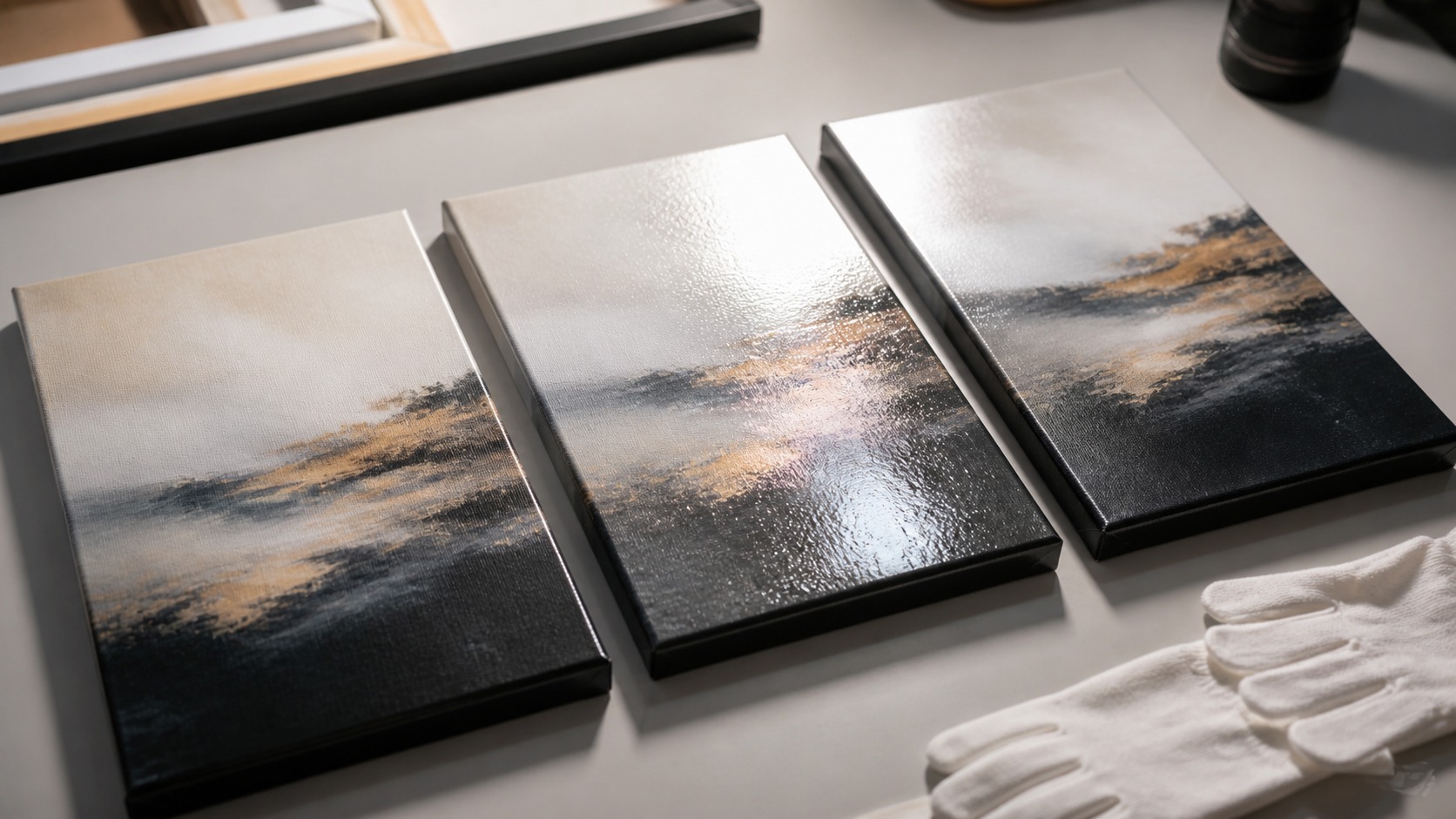
Canvas Finish Changes Both the Look and the Living Experience
Matte, glossy, and satin canvas finishes can make the same image feel surprisingly different. Finish affects glare, color depth, texture visibility, cleaning tolerance, room placement, and the way a print holds attention from across the room. There is no universal best finish because a quiet portrait, dramatic landscape, family photo, and commercial display each ask for a different surface behavior. The useful comparison is not which finish sounds premium, but which one supports the artwork and the room where it will live.
A: There is no universal best; satin is often the safest flexible choice.
A: It can look softer, but that restraint helps many images.
A: It can add punch, but glare may reduce real viewing quality.
A: It is a useful balance of color depth and glare control.
A: Gloss can visually emphasize coating shine, while matte keeps weave quieter.
A: Matte or satin usually handles window glare better than gloss.
A: Satin is often versatile, though bold photos may suit gloss.
A: Yes, sheen changes and smudges can appear differently by finish.
A: Yes, especially for large or important prints.
A: Match finish to image mood, room light, and viewing angle.
Matte Finish Keeps the Surface Quiet
Matte canvas finishes reduce reflection and keep attention on the image rather than the light source. They are especially useful in bright rooms, near windows, or in spaces with lamps that would otherwise bounce across the surface. A matte finish can make artwork feel soft, calm, and gallery-like. It is often the easiest finish to live with in ordinary homes.
The tradeoff is that matte surfaces may look less saturated than glossy ones. Deep blacks can feel softer, highlights may be less punchy, and high-contrast photography can lose a little drama. That is not always a flaw. For portraits, subtle landscapes, line work, and gentle color palettes, matte restraint can be exactly the point.
Texture remains visible under matte coating because the surface is not trying to act like glass. Canvas weave reads naturally, especially under side light. That makes matte a good fit when the buyer wants the print to feel like a tactile art object rather than a slick photo product. The finish supports the material identity of canvas.
Matte is also useful when the art will be seen from many angles. A hallway, open living area, or dining room rarely gives every viewer the perfect straight-on position. Lower reflection keeps the image democratic. More people can enjoy it without hunting for the one glare-free spot.
Matte can also help when the artwork contains fine line detail. Reflections across thin lines can make them harder to read, especially from an angle. A quiet surface keeps the viewer focused on drawing, texture, and composition. That makes matte useful for delicate work.
Matte also helps when the print is meant to sit near other wall decor. Because it does not throw reflections, it can share a wall with framed art, shelves, or lamps more quietly. The finish becomes part of the room's texture rather than a competing surface. That makes matte useful in layered interiors.
Glossy Finish Adds Drama and Reflection
Glossy canvas finish gives color more visual punch. Dark areas can feel deeper, bright colors can look more electric, and photographic details may appear crisp at first glance. For bold modern art, nightlife scenes, high-contrast landscapes, and commercial displays, gloss can create immediate impact. It is the finish people notice quickly.
The problem is glare. A glossy canvas can reflect windows, lamps, and bright room shapes, sometimes right through the best part of the image. That reflection can make the print harder to enjoy from normal seating positions. Gloss needs more careful room planning than many buyers expect.
Gloss also changes how texture is perceived. The coating can highlight the weave in a shiny way, which some people like and others find distracting. Small surface imperfections may become easier to see. The finish is bold, but it is not forgiving in every environment.
Cleaning expectations should be realistic. A glossy surface may appear wipeable, but canvas is still coated fabric, not glass. Fingerprints and smudges can show more easily, and aggressive wiping can create sheen changes. Gloss should be chosen for visual effect, not because it seems maintenance-free.
Gloss should be chosen with confidence, not habit. It can make a print feel expensive and immediate, but only when reflection sources are controlled. If the room has a large window directly opposite the wall, the shine may become the subject. Visual drama is valuable only when viewers can still see the image.
Glossy finish is less forgiving on imperfect walls and uneven light. If the wall has patchy illumination, the print may reveal that unevenness through reflection. This can be solved with better lighting, but it should be planned before ordering. Gloss rewards preparation.
Gloss can be beautiful on small pieces where reflections are easier to control. A compact canvas in a reading nook or hallway accent can deliver rich color without turning into a giant reflective plane. Problems grow with scale and light exposure. Size should temper enthusiasm for shine.
Satin Finish Balances Color and Glare Control
Satin sits between matte and glossy in both appearance and behavior. It gives color more richness than a very flat matte finish while controlling glare better than high gloss. That balance is why satin is common for home canvas prints, photography, and art that needs both depth and flexibility. It often feels polished without becoming flashy.
A satin finish can flatter a wide range of subjects. Portraits keep skin tones from looking too shiny, landscapes retain depth, and abstract work gains a slight glow without mirror-like reflection. It is not invisible, but it rarely dominates the image. For many buyers, satin is the safest middle path.
Lighting still matters. A satin canvas can reflect a bright window or lamp at certain angles, just less aggressively than gloss. Testing the print in the intended room is still wise. Balanced finish does not remove the need for thoughtful display.
Satin's strength is that it rarely feels unfinished. A very matte print can sometimes look too quiet in a darker room, while gloss can look too assertive in a casual home. Satin gives the canvas enough surface life to feel intentional. It is often the finish people keep liking after the novelty fades.
Satin can be the best answer for mixed collections. If a room includes photographs, painterly images, and bold color pieces, satin creates a shared surface language without flattening everything. That consistency helps a gallery wall feel intentional. Finish unity can organize diverse subjects.
Satin often performs well for gift orders because the buyer may not know the recipient's exact lighting. It keeps enough richness to feel polished while avoiding the strongest glare risk. That flexibility is practical when the final room is uncertain. A balanced finish can reduce regret.
Choose Finish by Image Type
The artwork should lead the finish decision. Soft watercolor-style art, black-and-white portraits, minimalist line work, and muted decor pieces often benefit from matte because the surface does not interrupt subtlety. High-energy photography, saturated abstracts, and dramatic night scenes may benefit from satin or gloss. The finish should amplify the image's natural character.
Dark images need special attention. Gloss can make blacks look deeper, but it can also reflect light across shadow areas. Matte avoids glare but may soften the drama too much for some images. Satin often gives a useful compromise for dark artwork in real homes.
Images with large pale areas can reveal coating behavior quickly. Glossy glare may be obvious across sky, snow, or white backgrounds, while matte may preserve a calmer surface. Satin can add gentle richness without making pale space feel slick. The best finish is easier to see when you imagine the largest flat areas of the image.
If possible, compare physical samples with similar artwork. Small printed swatches tell more truth than finish names. A finish that sounds ideal online may look different under your room's light. Canvas is tactile enough that physical viewing matters.
Skin tones are a useful finish test. Too much shine can make faces feel oily, while too little depth can make portraits feel flat. Satin or matte often works better for family images because expression remains more important than surface effect. The finish should not distract from people.
Sample comparisons should include one image with dark values and one with pale values. Dark passages reveal glare, while pale passages reveal coating texture and haze. A finish that looks good on only one test image may disappoint on another. Testing variety prevents narrow decisions.
The finish can also affect perceived sharpness. Gloss may make edges seem crisp because contrast feels stronger, while matte may make the same image feel softer and more atmospheric. Satin lands between those impressions. Sharpness is not only resolution; it is also surface behavior.
Choose Finish by Room Conditions
A room with strong windows, shiny floors, or many lamps is usually harder on glossy finishes. Matte or satin will often be more comfortable because the artwork remains visible from more angles. In a dim hallway or controlled studio, gloss can work without becoming distracting. Room light is part of the finish decision.
High-touch spaces also affect the choice. A hallway, restaurant, child's room, or busy office may expose the print to fingerprints, dust, and cleaning pressure. A finish should match not only the look but the practical life of the piece. Durability claims still need sensible handling.
Decor style matters too. Matte finishes often blend into softer interiors, satin feels versatile, and gloss can add a contemporary punch. The canvas should look at home with furniture, wall color, and lighting. A finish that fights the room will feel wrong even if the print itself is beautiful.
Room samples should be viewed upright because horizontal samples can mislead. A sample lying flat on a table catches overhead light differently than a canvas on a wall. Prop it near the intended location and look from real viewing points. Finish decisions improve when the test resembles the final display.
Cleaning guidance should be part of the finish conversation. Some coatings tolerate gentle dusting better than others, and some show wipe marks more readily. Ask the printer what not to do as clearly as what to do. Care instructions are part of finish quality.
If a canvas will hang near a window, test finish samples at the same time of day the room is brightest. A surface that looks perfect at night may behave badly at noon. Conversely, a finish that seems quiet in daylight may glow nicely under lamps. Time of day changes the answer.
The Best Finish Is the One You Can Enjoy Every Day
If you are unsure, satin is often the most flexible starting point. It offers richer color than matte while avoiding many of gloss's glare problems. That does not make it automatically best, but it makes it a strong choice when the room and image have mixed needs. Satin is a practical compromise, not a weak one.
Choose matte when calm viewing and low glare matter most. Choose gloss when impact, deep color, and controlled lighting matter more than reflection risk. Choose satin when you want polish, depth, and everyday flexibility. The finish should serve the image after the excitement of ordering has passed.
The final test is simple: imagine the canvas on the wall at the brightest and dimmest times of day. If the finish still lets you see the artwork comfortably, it is probably the right direction. A good finish disappears into the experience. It lets the image, texture, and room work together.
The best finish can also change by print size. A small glossy canvas may look jewel-like, while the same finish on a huge piece may create a broad reflection. A large matte piece may feel elegant, while a tiny matte piece may need stronger lighting. Scale and finish are linked.
A good printer should be willing to discuss tradeoffs instead of pushing one finish for every order. The best recommendation should mention the image, the room, the size, and the buyer's priorities. Finish choice is a design decision. It deserves more than a default checkbox.