Multi-Canvas Storytelling Needs Flow, Pause, and Clarity
A multi-canvas artwork can feel cinematic, immersive, and personal, but it can also confuse the viewer if every panel competes for attention. The challenge is to create movement across separate canvases while keeping the story easy to follow from normal viewing distance. That means planning sequence, scale, spacing, color, subject, and visual hierarchy before the pieces ever reach the wall. The viewer should sense a journey, not a puzzle they have to decode under pressure.
A: Use only as many as the story can support clearly.
A: They can be, but varied sizes work when hierarchy stays clear.
A: Enough to separate objects, not so much that the story breaks.
A: No, the basic flow should be visual.
A: Yes, through color, rhythm, contrast, and movement.
A: Place it where the sequence naturally builds or resolves.
A: No, quieter panels help pacing and clarity.
A: Lay out templates and track what the eye notices first.
A: Yes, furniture can visually bind or disrupt the group.
A: Clear sequence, repeated cues, spacing discipline, and hierarchy.
Start with One Clear Story Spine
Before choosing panel sizes, decide what the series is actually about. The spine might be a journey through a landscape, a change in light, a family timeline, an abstract emotional progression, or a city scene unfolding across distance. That central idea gives every canvas a reason to exist. Without it, the arrangement becomes a collection of related images rather than a story.
A strong spine can be simple. A coastline moving from morning to evening, a dancer crossing space, or a color palette shifting from calm to intensity may be enough. The viewer does not need a written explanation if the visual movement is clear. The story should be felt before it is analyzed.
Avoid asking each panel to carry a separate message. When every canvas has its own climax, the group becomes noisy. Give the sequence a beginning, development, and arrival point. The panels should share responsibility instead of competing for the spotlight.
A story spine also helps when selecting images from a larger set. Instead of choosing five favorites, choose the five that move the idea forward. A beautiful image that interrupts flow may belong somewhere else. Editing is what turns a collection into a sequence.
The spine can be emotional rather than literal. A series might move from solitude to connection, tension to release, or shadow to warmth without showing a narrative scene. What matters is that the viewer can feel progression. Abstract stories still need structure.
A story spine can also prevent overbuying panels. More canvases do not automatically create a richer story, and too many panels can dilute the central idea. If a three-panel sequence says everything clearly, forcing it into five may weaken it. Panel count should come from narrative need.
Use Panel Order to Guide the Eye
Most viewers in Western interiors read wall sequences from left to right unless the composition strongly suggests another path. Use that habit when planning a multi-canvas story. The first panel can introduce setting or mood, middle panels can develop motion or tension, and the final panel can resolve the visual idea. Order turns separate canvases into a sequence.
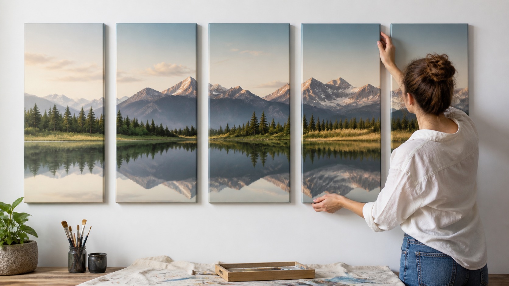
Visual cues can reinforce direction. A road, shoreline, gaze, shadow, color gradient, or repeated shape can pull the eye from one panel to the next. Those cues do not need to be obvious arrows. Subtle continuity often feels more sophisticated than literal instruction.
Panel order should be tested before hanging. Lay the images on the floor or mock them on a wall and watch where your eye goes first. If the viewer jumps randomly between panels, the sequence may need a stronger anchor. The goal is guided freedom, not forced reading.
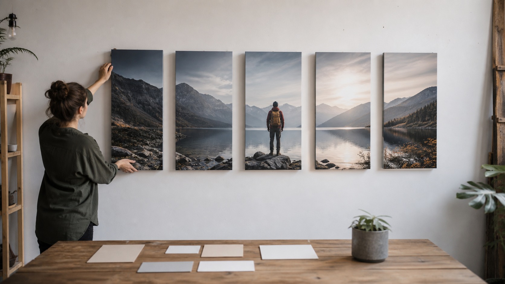
Sometimes the central panel deserves the strongest moment. A triptych or five-panel arrangement can build toward the middle and then release outward. That structure works well for landscapes, portraits, spiritual themes, and dramatic abstracts. The sequence does not always have to end on the far right.
Direction can be created through scale as well as subject. A figure growing larger, a landscape opening wider, or a color field expanding across panels can all suggest movement. The viewer reads those changes instinctively. Good panel order uses that instinct.
Panel order should also respect architectural interruptions. Doors, windows, sconces, and shelves can break a sequence if the arrangement ignores them. Sometimes the story needs fewer panels or a different wall to remain readable. The room is part of the edit.
Transitions between panels should be intentional. A sudden jump can work if it marks a dramatic turn, but accidental jumps make the viewer feel as if something is missing. Use overlap, repeated color, or directional movement to bridge important gaps. The eye appreciates a handoff.
Control Spacing So the Story Stays Connected
Spacing is the silent grammar of multi-canvas art. Too little space makes panels feel cramped, while too much space breaks the story apart. The gaps should be wide enough to honor each canvas as an object and narrow enough that the viewer understands they belong together. Spacing decides whether the story reads as one composition.
Keep gap logic consistent unless variation has a purpose. A slightly wider pause before the final panel can feel intentional if the story needs a breath, but random gaps look like installation mistakes. Measure carefully and use templates before hanging. Precision supports storytelling.
Wall size also affects spacing. A small wall may need tighter gaps and fewer panels, while a large wall can handle more breathing room. Do not stretch a story too far just to fill space. If the viewer cannot connect the panels in one glance, the sequence may be too dispersed.
Furniture below the artwork matters. A sofa, console, bed, or dining table can visually bind the panels together. Center the group as a whole rather than treating each canvas independently. Multi-canvas storytelling works best when the installation reads as one designed unit.
Gaps should be tested with the actual panel depth in mind. Deep gallery wraps cast shadows that make spaces feel wider, especially under side light. A gap that looks fine on paper may feel too large once shadows appear. Physical mockups reveal those effects.
Spacing changes the speed of the story. Tight gaps make the sequence feel continuous and fast, while wider gaps slow the viewer down. Neither is automatically right. The gap should match the emotional pacing of the artwork.
Spacing should also account for the canvas side color. Dark wrapped edges make gaps feel stronger, while pale or image-wrapped edges can make panels feel closer together. The same measured gap may read differently depending on edge treatment. Story rhythm is visual, not only numerical.
When panels vary in size, spacing should respond to visual weight rather than only equal measurements. A larger dark panel can feel closer than a smaller pale one at the same gap. Adjust with the eye after using the ruler. Story rhythm depends on perceived balance.
Create Variety Without Breaking Unity
A multi-panel story needs variation, or the viewer has no reason to keep looking. Changes in scale, crop, focus, color, or subject position can create movement. The danger is changing too much at once. Unity gives the eye confidence while variety gives it momentum.
Repeat one or two visual elements across the sequence. A color family, horizon line, figure direction, brush texture, or lighting style can hold the panels together. Then let other elements evolve. The viewer should recognize the world of the story even as it changes.
Use contrast carefully. A sudden dark panel, bright color, or close-up detail can create a memorable turning point. If every panel uses the same intensity, nothing feels important. If too many panels shout, the story loses shape.
Negative space can be part of the narrative. A quiet panel between busier images gives the viewer a pause, much like a paragraph break. That pause can make the next panel more powerful. Storytelling is not only about adding information; it is also about pacing attention.
Unity can also come from shared edge treatment. Matching wrap color, canvas depth, and finish helps separate images feel designed as a set. If one panel has a different surface or side treatment, it may look accidental. Production consistency supports narrative unity.
Color unity is often more powerful than subject repetition. Panels can show different scenes if they share temperature, contrast, and atmosphere. Conversely, identical subjects can still feel disconnected if color jumps wildly. The viewer reads mood quickly.
Variety can come from cropping instead of changing subjects. One wide scene, one close detail, and one atmospheric panel can feel like a camera moving through the same world. That keeps unity while giving the viewer fresh information. Cropping is a storytelling tool.
Keep the Viewer Oriented from Normal Distance
A multi-canvas story should work from the distance where people actually see it. Tiny details that only make sense up close may be lost over a sofa or across a hallway. Use large visual relationships first: direction, color, scale, light, and subject placement. Details can reward closer viewing after the main story is clear.
Avoid too many focal points. If each panel has an equally strong subject at the same size and intensity, the eye may bounce without understanding priority. Give the series a dominant moment and supporting moments. Hierarchy keeps the viewer from feeling lost.
Titles and explanations should not be required for basic flow. They can enrich a series, but the wall itself should communicate sequence and mood. If the arrangement only works after a long explanation, simplify the visual path. Good multi-canvas storytelling is generous to the viewer.
Viewer orientation improves when the first glance offers a clear reward. A strong opening panel or central focal point gives people somewhere to begin. From there, smaller cues can lead them through the rest. Without an entry point, the wall can feel scattered.
A viewer should not need to inspect every panel closely to understand the sequence. The big moves should be visible first, then smaller details can invite closer study. This is especially important above sofas or beds where viewing distance is fixed. Clarity begins at room scale.
If the viewer gets lost, simplify the hierarchy before changing everything. Make one panel clearly primary, reduce contrast in a competing panel, or adjust spacing around the turning point. Small edits can restore flow. Confusion often comes from too many equal signals.
Test the Story Before Final Installation
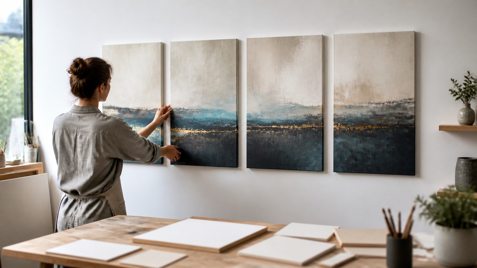
Before committing to hardware, test the full arrangement at real scale. Use paper templates, floor layouts, or temporary placement to compare spacing and sequence. Step back, enter the room, sit down, and see whether the story still reads. The first draft on the wall is rarely the final answer.
Ask what the viewer notices first, second, and last. If that order matches the intended story, the structure is working. If attention skips the important transition, adjust crop, spacing, or panel order. Storytelling is edited as much as it is designed.
When the sequence works, the panels feel inevitable. Each canvas has its own presence, but the group creates something larger than any single piece. That is the promise of multi-canvas storytelling. It turns a wall into a visual experience with rhythm, memory, and movement.
A finished multi-canvas story should still allow discovery. The first pass gives the viewer the flow, and later viewing reveals smaller relationships between panels. That layered experience keeps the arrangement interesting without making it confusing. Clarity and depth can share the same wall.
Installation tests should include the room's furniture and walking paths. A sequence that reads well from straight ahead may fail when the normal approach is from the side. Walk into the room the way guests will. The story should reveal itself in the real choreography of the space.
The final arrangement should make each panel feel necessary. If removing one canvas improves the sequence, the story was carrying extra weight. If adding a panel clarifies the transition, the story may need more space. Multi-canvas design is edited until the wall feels inevitable.
If the sequence will be photographed or shared online, test it through a camera as well as in person. Photos flatten spacing and can reveal awkward jumps in flow. That does not mean the camera gets the final vote, but it can expose problems quickly. A strong wall usually reads well in both modes.