Panel-to-Panel Flow Depends on What Crosses the Gap
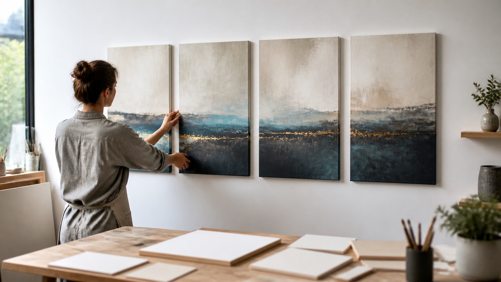
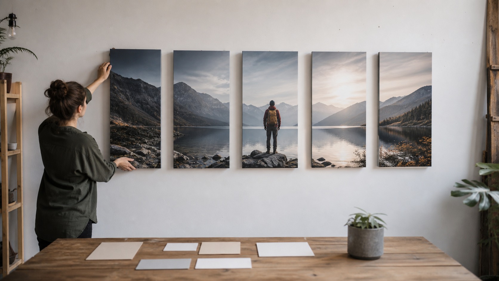
Panel-to-panel stories flow when the viewer's eye knows how to move across the spaces between canvases. Those gaps can feel like pauses, cuts, breaths, or bridges depending on how the image is designed and installed. Flow is built from aligned horizons, repeated shapes, directional light, pacing, and careful spacing rather than from simply slicing one image into parts. When the handoff between canvases is clear, the viewer experiences motion instead of interruption.
A: Clear visual handoffs, spacing rhythm, alignment, color, and focal movement.
A: No, gaps can create rhythm when designed carefully.
A: Usually yes for continuous landscapes or panoramic scenes.
A: Yes, through repeated shape, color, tone, and pacing.
A: Wide enough to breathe, narrow enough to keep the story connected.
A: Yes, if visual weight and flow remain clear.
A: Random spacing, competing focal points, and accidental misalignment.
A: Yes, full-size templates prevent most flow mistakes.
A: Yes, uneven glare or brightness can disrupt the sequence.
A: The viewer's eye should move naturally without explanation.
Decide What Should Travel Across the Panels
Begin by choosing what will cross the gaps. It might be a literal horizon, a road, a river, a figure's movement, a color gradient, a shadow path, or a repeated abstract shape. The traveling element gives the eye something to follow. Without it, the panels may feel related but not sequential.
For continuity to survive separation, the traveling element has to be strong. A tiny detail that disappears in the gap cannot carry the sequence from normal viewing distance. Use larger relationships first, then let small details enrich the journey. The viewer needs a clear handoff before subtlety matters.
Do not let too many elements travel at once. If color, line, subject, scale, and texture all change aggressively, the eye may lose the path. Choose one or two main continuity devices. Flow feels natural when the viewer has enough guidance but not too much noise.
Movement across panels can be emotional rather than literal. A panel may hand off from anxiety to calm through softer contrast, or from isolation to openness through widening space. Viewers can follow those changes without seeing one continuous object. Flow is about felt movement as much as depicted movement.
Just as important is deciding what should not cross the gap. A distracting branch, bright corner, or awkward partial object at the edge can stop the viewer even when the main line continues. Edit panel edges with special care. The gap makes edge decisions more visible than they would be in one uninterrupted canvas.
Use Alignment to Make Gaps Feel Intentional
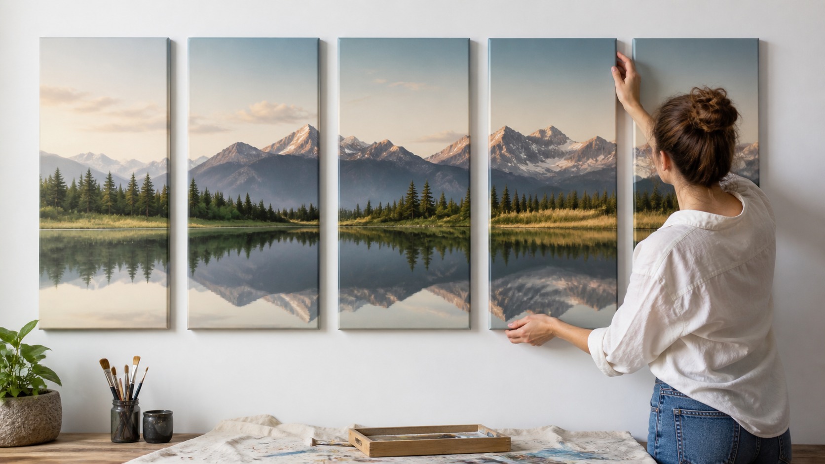
Good alignment is one of the strongest tools for panel-to-panel flow. A horizon that continues across several canvases can make separate panels feel like one wide visual field. A repeated vertical edge, shoreline, tree line, or architectural rhythm can do the same. The eye trusts continuity when important lines know where they are going.
Misalignment can be useful only when it has a clear purpose. A sudden shift might signal a jump in time, a change in mood, or a break in memory. If the shift is accidental, viewers read it as a mistake. Intentional disruption still needs design discipline.
Use templates or a full-size mockup to test alignment before hanging. Small height differences can break a continuous line and make the story feel clumsy. This is especially true with landscapes and panoramic artwork. The hardware plan should protect the visual plan.
Panel depth affects alignment too. Deep gallery wraps cast shadows that can make a line feel interrupted even when measurements are correct. Look at the set under actual room light. Flow is judged by perception, not only by the ruler.
Before cropping is finalized, choose the alignment strategy. If a mountain ridge, table edge, or architectural line lands awkwardly near a panel break, no amount of hanging precision will fix it. Crop with the eventual gap in mind. The print file and the wall plan should be designed together.
When a continuous image is divided, allow for wrap and bleed. Important lines that disappear around the side edge may not reconnect visually on the wall. The printed object has thickness, so the design should account for what is lost at the wrap. Flow has to survive production, not just layout.
Vertical alignment matters for non-landscape subjects too. A repeated shoulder line, tabletop, doorway, or abstract band can create continuity even when there is no horizon. Identify the dominant visual line before hanging. The viewer needs something dependable to track.
Control Rhythm with Gap Size
Between canvases, empty space acts like timing in a story. A narrow gap makes the viewer move quickly, while a wider gap creates a pause. Neither is automatically better. The right gap depends on whether the story should feel continuous, reflective, dramatic, or spacious.
Continuous landscapes usually need disciplined spacing. If the gap grows too wide, a mountain ridge, shoreline, or reflection can feel broken. Tighter spacing keeps the scene connected while still letting each canvas remain an object. The gap should be seen but not allowed to steal the story.
Abstract and emotional sequences can use more varied pacing. A wider pause before a high-contrast panel can feel like a breath before a reveal. A cluster of tighter panels can feel energetic. Spacing becomes expressive when the pattern supports the mood.
Furniture and wall size limit rhythm choices. A small wall may not have room for five generous gaps, while a long wall may make tight spacing feel cramped in the middle of emptiness. The installation should fit the architecture. Flow works best when image rhythm and room rhythm agree.
Spacing rhythm can create expectation. When several gaps are consistent, a deliberate change becomes noticeable and meaningful. That change can mark a pause, a reveal, or a shift in mood. The viewer reads spacing the way they read timing in music.
Measure gap size in inches rather than guessing from a screen mockup. A gap that looks elegant on a monitor may feel too wide when the panels are deep and life-size. Cut paper strips or use cardboard spacers during planning. Physical distance changes visual rhythm.
Repeat Color and Light as Visual Bridges
Repeated color can carry the eye across panel breaks even when subject matter changes. A warm accent repeated from one canvas to the next can act like a thread. A gradual shift from cool to warm can suggest time, distance, or emotional movement. Color bridges are often felt before they are consciously noticed.
Lighting direction should also be coherent. If one panel is lit from the left and the next from the right without purpose, the sequence may feel inconsistent. Shared light makes separate scenes seem part of one world. Changed light can work when it marks a meaningful turn.
Tone is just as important as hue. A sequence that jumps from very dark to very pale and back again may feel choppy unless the contrast is part of the design. Use value changes to pace attention. A controlled tonal path can make panels feel connected even with different subjects.
Shared glow is especially useful when panels show different parts of a scene. A repeated shadow direction or consistent sky value can make separate views feel simultaneous. Without that agreement, the set may feel like unrelated moments. Light tells the viewer whether the world is shared.
Color bridges should not become too mechanical. Repeating the same accent in the same location on every panel can feel like a pattern rather than a story. Let the color evolve in size, intensity, or position. A bridge should guide the eye while still feeling alive.
Repeated light and color can also repair a necessary break. If a doorway, window, or architectural feature forces a wider gap, repeated glow or tonal direction can help the sequence reconnect visually. The artwork can acknowledge the room's interruption. Flow sometimes adapts rather than fights.
Protect color from accidental printing changes when it is the main bridge. A slightly warmer panel can interrupt flow even when the composition lines up. Proof the panels together, not one at a time. Consistent output keeps the visual handoff clean.
Place Focal Points Like Stepping Stones
Attention points guide the viewer through the story. If every canvas places its focal point in the same spot, the set can feel static. If focal points jump randomly, the viewer can feel lost. A flowing sequence places attention like stepping stones across the wall.
At the start, the first focal point should be easy to find. From there, later focal points can move gradually across panels, rise or fall, or build toward a central moment. This movement gives the eye a path. Good flow feels discovered rather than forced.
Supporting detail should not overpower the path. A bright corner, high-contrast object, or isolated detail can accidentally become the main attraction. Review each panel for distractions after the whole set is assembled. A single noisy detail can break panel-to-panel movement.
By the end, the final focal point should feel earned. It may resolve the direction, echo the opening, or leave the viewer with a deliberate sense of continuation. What matters is that the ending feels designed. A flowing story needs somewhere meaningful to arrive.
Important focal points should not sit too close to panel edges unless the edge itself is part of the tension. Subjects pressed against gaps can feel cut off or accidental. Give key moments enough room to breathe. The edge of each canvas is a powerful compositional boundary.
Attention can move along a diagonal, arc, wave, or alternating rhythm. It does not have to march straight from left to right. What matters is that the movement feels intentional and recoverable. The viewer can enjoy complexity when the path remains legible.
Test Flow in the Actual Room
Flow cannot be judged only on a screen. The wall, lighting, furniture, viewing distance, and walking path all change how panels connect. Print templates or test placements before final hardware. A sequence that looks smooth on a monitor may feel too spread out in a room.
Walk past the arrangement at normal speed. Notice whether the story reveals itself naturally or feels like separate stops. Then sit where people will actually view the art and see whether the order remains clear. Flow has to work in motion and at rest.
Adjust one thing at a time. Change spacing, order, height, or lighting separately so you know what improved the sequence. Large rearrangements can hide the actual problem. Panel-to-panel flow is often refined through small edits.
When the sequence works, the gaps stop feeling like interruptions. They become rhythm, breath, and structure. That is the difference between several canvases and a true multi-canvas story. The viewer moves because the artwork knows how to lead.
Testing flow should include a quick memory check. Look away after viewing the sequence and ask what movement you remember. If the memory is clear, the flow is working. If you remember only separate panels, the handoffs need more strength.
A flowing multi-canvas story can still contain surprise. The goal is not total predictability; it is readable movement. A turn in color, scale, or shadow can wake up the sequence when the viewer already understands the path. Surprise works best after orientation.
Before final hanging, invite someone unfamiliar with the design to look at the mockup. Ask where their eye begins and where it goes next. Their answer may reveal a distraction you stopped seeing. Fresh viewing is useful because flow is experienced quickly.
If the story still feels broken, simplify the panel count. A four-panel sequence with strong handoffs is better than a six-panel sequence with weak connections. More pieces increase the burden on flow. Use only the number of breaks the idea can carry.
After the panels are level, do a final flow check. Crookedness can masquerade as a design problem because the eye struggles to connect misaligned edges. Fix the installation basics before judging the story. Good craft gives the visual rhythm a fair chance.