Connected Canvas Artwork Needs One Idea with Many Roles
Multi-canvas storytelling works when separate pieces feel like parts of one intentional visual system. Panels may form a continuous scene, a rhythm of related moments, or a sequence of mood changes, but the viewer should understand why the canvases belong together. Connected artwork needs more than matching colors; it needs a governing idea, clear roles for each panel, consistent production choices, and spacing that lets the group read as one experience. When those decisions are made before printing and hanging, the wall feels composed instead of assembled from attractive leftovers.
A: No, but it needs a clear visual or emotional rule.
A: Use the number the idea can support without repetition.
A: They can be, but varied sizes work when roles stay clear.
A: Color, light direction, edge treatment, and repeated shapes help quickly.
A: Yes, quiet panels can improve pacing and hierarchy.
A: Usually yes, unless contrast is part of the concept.
A: Give each panel a role and remove anything redundant.
A: Spacing should match the desired rhythm and wall size.
A: Yes, if the sequence has visual unity beyond shared people.
A: The group should read clearly from distance and reward closer viewing.
Define the Connection Before Designing Panels
Strong connected artwork begins with a single organizing idea. That idea might be a place, season, emotional arc, family memory, architectural rhythm, or abstract movement from quiet to intensity. It gives the set a reason to exist beyond decoration. Without it, multiple canvases can look coordinated but still feel empty.
Write the connection in one plain sentence before choosing crops or sizes. If the sentence is vague, the artwork will probably be vague too. A clear sentence helps decide what belongs, what distracts, and where the sequence should end. The wall needs a story spine before it needs hardware.
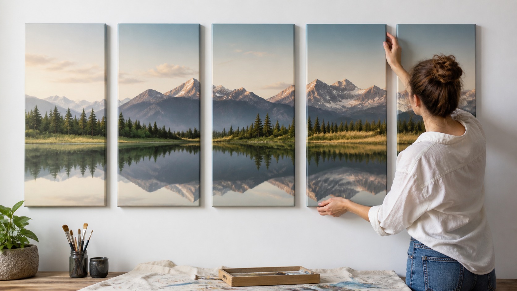
Continuity is only one possible kind of connection. A four-panel set can show different views of the same city, stages of a storm, or variations on one color relationship. What matters is that the viewer can sense the rule tying them together. The rule may be visual, emotional, or narrative, but it must be present.
From across the room, the connection must still hold. People often see multi-canvas artwork from a distance first, then move closer later. Large relationships such as color, horizon, light, shape, and direction must carry the first impression. Tiny details can enrich the set, but they should not be the only glue.
Memory gives connected artwork another useful test. The viewer might leave with a sweep of color, a sense of travel, a family season, or the feeling of weather moving across a wall. That remembered impression helps judge which details matter. A strong set leaves one clear afterimage.
For commissioned artwork, plan with the artist or print studio before individual panels are finalized. Crops, bleed, wrap edges, and finish choices all affect whether the set feels continuous. A beautiful digital mockup can fail if the printed edges cut through important transitions. Production planning protects the concept.
Early planning should also name what the set is not trying to do. A connected artwork may not need to show every moment, every color, or every favorite image. Limits give the series shape. A clear boundary helps the wall feel intentional.
Give Every Canvas a Distinct Job
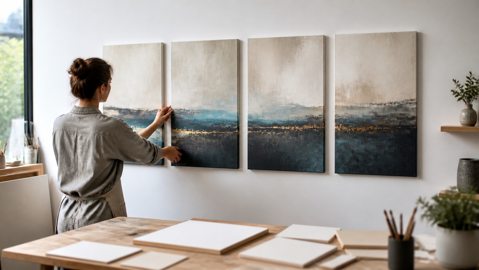
Distinct roles make a connected set more interesting. One canvas may introduce the setting, another may create movement, another may deliver the visual climax, and another may resolve the mood. Those roles keep the group from feeling repetitive. The viewer should not feel that the same idea was merely copied several times.
Role does not require equal intensity. Supporting panels can be quieter, more spacious, or more tonal than the main panel. That restraint helps the important moment stand out. If every canvas shouts, the group loses hierarchy.
An opening panel should invite attention without exhausting the story. It can establish color, direction, or atmosphere while leaving room for development. Middle panels can carry transition and variation. The final panel should feel like an arrival, release, or satisfying continuation.
When designing a set, remove one panel mentally and ask what disappears. If nothing important changes, that canvas may not have a real job. Connected artwork becomes stronger through editing. Every panel should earn its wall space.
During planning, panel roles can be named. Calling one canvas the entry, one the bridge, one the anchor, and one the resolution helps keep decisions concrete. Those names are private design tools, not labels for the wall. They prevent the set from drifting into sameness.
Contrast can also define the roles within a connected set. One panel may be dense and active while another is open and quiet, as long as both belong to the same world. This contrast creates rhythm instead of repetition. The viewer understands the story because the differences have purpose.
Use Shared Visual Language Without Flattening the Set
Unity comes from repeated visual language. A consistent color family, shared texture, common horizon height, repeated shape, or matching finish can tell the viewer the panels belong together. These recurring elements reduce confusion. They let variation happen inside a stable world.
Too much sameness can flatten the experience. If every panel has the same scale, crop, contrast, and focal weight, the viewer may scan once and move on. Connected artwork still needs development. Variation gives the eye a reason to travel.
Color is one of the easiest ways to build unity. A warm accent repeated in several panels, a gradual shift from blue to amber, or a controlled neutral base can create coherence even when subjects change. Color should feel intentional rather than accidental. The palette is the emotional weather of the set.
Production consistency matters too. Canvas depth, finish, edge treatment, and print quality should usually match across the group. A single glossy panel among matte pieces can look like a mistake unless contrast is part of the concept. The object-level details support the story before anyone reads the image.
A common visual language should be strong enough to cover small differences in subject. If every canvas shares light direction, finish, and color temperature, the group can handle changes in crop or detail. This is especially useful for collections built from photography or mixed scenes. Unity gives variety permission to exist.
Finish consistency should be checked under the same light. Two panels printed at different times or coated differently can shift the mood even when the image files match. Slight surface differences become obvious when pieces hang side by side. Connected work asks production to be consistent.
Silence can be part of the shared language. Repeated quiet areas, soft backgrounds, or open skies can connect panels as effectively as repeated subjects. These calmer passages let the set breathe. Unity is often built from restraint.
Plan Scale, Crop, and Spacing Together
Scale works as storytelling language. A large central canvas can act like a main character, while smaller panels can behave like supporting scenes or pauses. Equal panels can feel calm and orderly, while varied sizes can create movement. The right scale pattern depends on the story's rhythm.
Cropping controls what the viewer knows and when. A wide crop can establish place, a close crop can create intimacy, and a partial crop can make the sequence feel like it continues beyond the wall. Connected artwork often fails when every panel uses the same distance. Camera-like variation helps the story breathe.
Spacing decides whether panels feel connected or isolated. Narrow gaps create continuity, wider gaps create pause, and inconsistent gaps create doubt unless they are purposeful. Use templates before installing the final pieces. A few inches can change the reading of the whole set.
Furniture should be planned as part of the composition. A sofa, console, bed, or dining table can visually bind several panels into one group. Center the set as a whole rather than centering each canvas independently. Connected artwork needs a connected installation.
Scale should be tested against human presence in the room. A set that looks powerful on an empty wall may feel too high or too wide once furniture and people are included. Stand, sit, and walk past the mockup before deciding. Connected artwork has to live at room scale.
Price and available wall width should not be the only forces behind panel size. A narrow panel can feel like a transition, a square panel can feel stable, and a wide panel can feel cinematic. Shape carries meaning. The format should be part of the story.
Test the Wall Before Committing
Full-size mockups prevent expensive disappointment. Use paper templates, floor layouts, or temporary wall placement to test the sequence at full size. Walk into the room, sit down, and view the set from side angles. A connected artwork must work in the actual room, not only in a design file.
Check the first read. Ask what your eye notices first, where it moves next, and whether the ending feels satisfying. If the sequence is hard to follow, simplify hierarchy before adding more panels. Clarity is usually improved by editing, not crowding.
Lighting should be reviewed before final hanging. A reflection across one panel can break the story, and uneven illumination can make a supporting panel look accidentally important. Connected artwork benefits from even, gentle lighting unless contrast is part of the concept. The room's light becomes part of the composition.
Once the set is hung, live with it briefly before declaring it finished. Small spacing or level changes may become obvious after a day of normal viewing. Connected art should feel calm after the novelty fades. The best arrangement keeps rewarding attention without demanding explanation.
Trial layouts also reveal whether the set needs more quiet space. Designers often notice that a crowded arrangement weakens an otherwise strong idea. Removing a panel, widening a gap, or simplifying the crop can make the story easier to enter. Editing is not a loss of ambition.
Include the negative space around the group in every mockup. The wall above, below, and beside the set changes whether the artwork feels expansive or crowded. A connected series needs enough room to be understood as one composition. Space outside the panels is still part of the viewing experience.
Judge the final proof as a group, not as five separate files. Small differences in brightness or crop can seem harmless alone and disruptive together. Review the sequence at the same scale and under the same light. Connected artwork succeeds through relationships.
Let the Group Feel Bigger Than the Parts
Owning more canvases is not the purpose of multi-canvas storytelling. It is to create a wall experience that a single image could not provide in the same way. The gaps, roles, repetitions, and shifts all contribute to that larger effect. The group should create momentum.
A successful set gives each panel dignity while making the relationship more powerful than any single piece. Viewers can enjoy one canvas up close and then step back to understand the whole. That movement between part and whole is the pleasure of connected artwork. It turns viewing into discovery.
As a final standard, simplicity matters but demands discipline. If the viewer immediately senses connection and then wants to keep looking, the set is working. If the viewer feels lost, the design needs clearer roles, stronger repetition, or calmer spacing. Connected artwork is planned generosity.
Even standalone panels need a reason to remain connected. Each individual canvas may be attractive, but the wall should become more meaningful when they are seen together. That extra meaning is the purpose of the format. Without it, the set is only coordinated decor.
Final installation choices should support maintenance as well as mood. Matching hardware, consistent top lines, and accessible spacing make the set easier to dust and straighten. A connected artwork that is hard to care for may slowly lose its precision. Practical details help the visual idea last.
If the connected artwork is part of a larger room design, coordinate it with textiles, wall color, and lighting. The set may carry the main atmosphere of the room, so competing patterns or harsh fixtures can weaken it. Good surroundings help the story read. The wall and room should speak the same language.