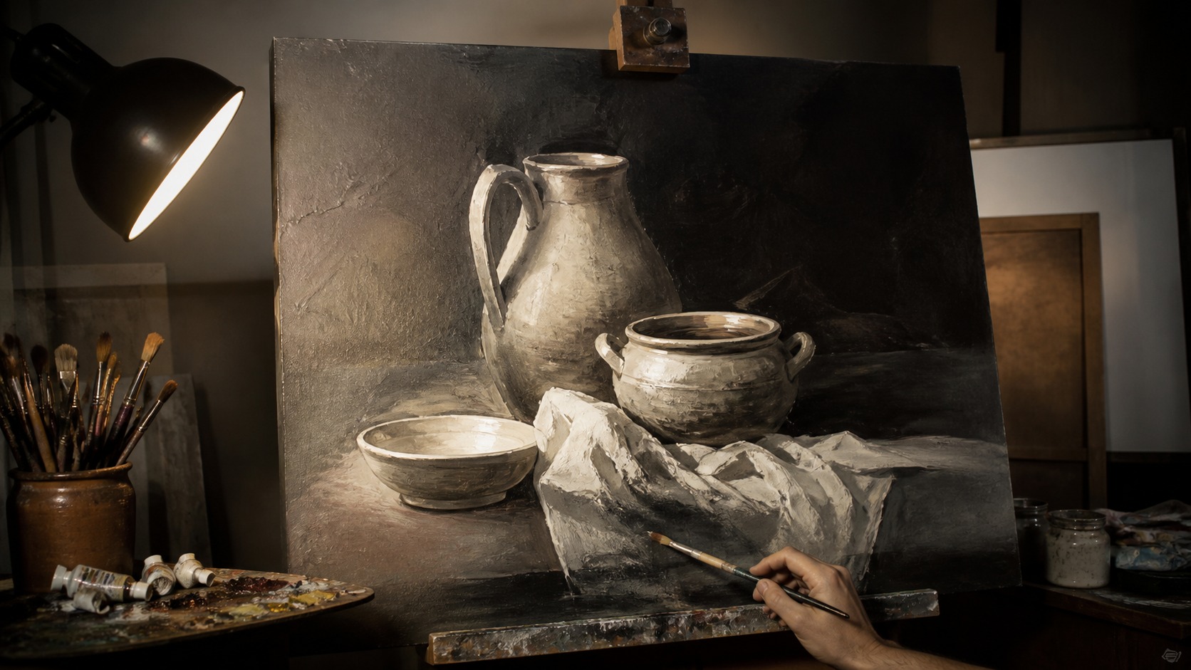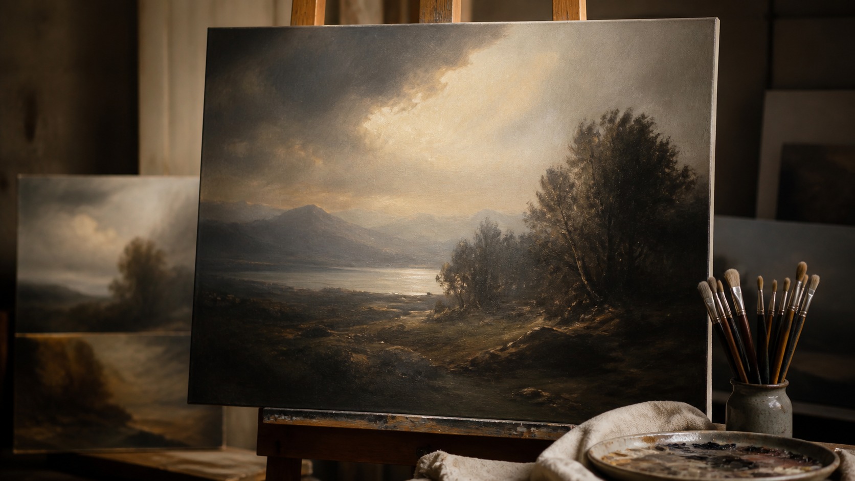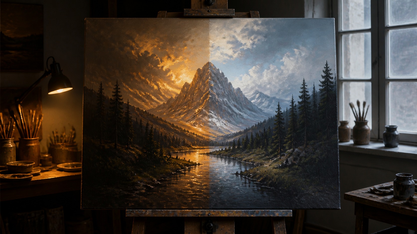
Lighting Can Change the Emotional Temperature of a Painting
No painting carries its mood alone; the light around it changes how color, texture, contrast, and subject are felt. Warm light can make a scene feel intimate, nostalgic, or dramatic, while cooler light can make the same work feel quieter, clearer, or more distant. Direction matters too because side light reveals texture, frontal light flattens, and low light can turn gentle shadows into emotional weight. Understanding lighting helps artists, collectors, and decorators protect the intended mood instead of letting the room rewrite it by accident.
A: Yes, it changes color, contrast, texture, and emotional tone.
A: Only when warmth supports the painting's palette and mood.
A: Yes, especially for blue, gray, modern, or spacious palettes.
A: Directional light and deeper shadow create drama quickly.
A: Yes, excessive brightness can flatten mystery and atmosphere.
A: Angle, finish, windows, and viewing position all contribute.
A: Dimmers help tune mood for different times of day.
A: Yes, reflected color can affect how the painting feels.
A: View the painting from normal positions at different times.
A: The artwork feels clearer and more itself.
Warm Light Makes Paintings Feel Closer
Warm light often makes paintings feel more human and immediate. It enriches reds, ochres, browns, golds, and skin-like tones, so interiors, portraits, landscapes, and still lifes can feel more inviting. The effect is emotional before it is technical. A viewer may not name the color temperature, but they can feel the room becoming softer.
Warmth can also distort the artist's balance. Cool grays may turn beige, whites may look creamier, and blue shadows can lose their quiet tension. That may be welcome for some traditional paintings and distracting for others. The mood improves only when the warmth agrees with the work.
Evening lamps are especially influential because they often become the dominant light source in a home. A painting that feels fresh in daylight may feel mellow or theatrical at night. That shift can be beautiful if planned. If not, the painting may seem inconsistent from one part of the day to another.
To test warm light safely, look at the actual artwork rather than the bulb alone. Study the most delicate colors, not only the boldest ones. If the painting becomes richer without losing important cool relationships, warmth is helping. If everything turns amber, the room is overpowering the art.
Under warm light, texture can feel more tactile. Brush ridges catch amber highlights and can make the surface appear closer to the viewer. This is beautiful for expressive paint handling, but it can over-romanticize cooler work. Surface and palette should be judged together.
Amber illumination can also change the apparent age of a painting. It may make a new canvas feel older, softer, or more traditional, which can be pleasant in some interiors. In a contemporary piece, that same warmth may dull the intended crispness. Mood includes the era a painting seems to belong to.
Small paintings can feel especially intimate under warm light. A modest canvas under a nearby lamp may feel like a private object rather than a public statement. That can be ideal for reading corners, bedrooms, and quiet hallways. The same warmth on a large dramatic canvas may feel theatrical instead.
Cool Light Creates Distance and Clarity
Cooler light can make a painting feel more spacious, modern, or contemplative. It can preserve blues, greens, whites, and subtle grays more accurately than very warm bulbs. For coastal scenes, winter landscapes, minimalist work, and contemporary palettes, cool-neutral light may protect the intended atmosphere. It can make the image breathe.
Excess coolness can make a room feel clinical. A painting that should feel tender or earthy may become detached under harsh blue light. The issue is not simply cool versus warm; it is whether the light supports the painting's emotional promise. Clarity without comfort can feel sterile.
Neutral light is often a useful middle ground. It keeps color believable while avoiding strong amber or blue casts. For mixed collections, neutral lighting can prevent one painting from looking favored and another from looking wrong. Mood becomes easier to control when the light is not extreme.
Pale paintings are particularly revealing under cool light. It can keep whites crisp and preserve delicate blue-gray relationships that warm lamps might dull. That clarity can make the painting feel more spacious. The risk is losing the warmth that made the subject inviting.
Beneath cool light, brushwork can feel more analytical. Texture and edge relationships may appear sharper, which helps some modern paintings and weakens some romantic ones. The viewer may feel distance rather than embrace. That emotional distance can be useful when the artwork asks for it.
Balanced cooler illumination can reveal when a painting relies on subtle neutral mixtures. Grays, pale blues, and soft greens may separate more clearly under cool-neutral light. That can make atmospheric work feel cleaner and more spacious. The danger is pushing the room beyond comfort.
Direction Changes Texture and Drama
Angle changes how a painting's surface speaks. Side light reveals brush ridges, canvas weave, palette-knife marks, and layered varnish. That can make the painting feel physical and alive. It can also exaggerate every bump if the angle is too steep.
Frontal light is more even and often safer for readability. It reduces shadow across texture and lets color relationships stay clear. The tradeoff is that the painting may feel flatter, especially if the surface was meant to be tactile. Evenness is useful, but it can reduce drama.
Low directional light creates mood quickly. It can make shadows deeper, highlights more selective, and the subject feel staged. That is useful for dramatic paintings but risky for quiet ones. Lighting direction should be chosen as part of interpretation, not just visibility.
Glare complicates direction. A glossy varnish or satin coating may catch a lamp from one viewing angle and disappear from another. Before deciding a painting needs more light, adjust the angle. Often the problem is placement rather than brightness.
Texture-heavy paintings deserve a careful angle test. A small adjustment can make impasto glow or turn it into distracting ridges. The best direction shows enough surface to honor the hand of the artist without making texture the only thing viewers notice. Mood needs texture in proportion.
Direction should also respect varnish and coating. A beautiful raking light can become a glare problem if the surface is reflective. In that case, a softer wider source may preserve mood better than a narrow beam. The most dramatic angle is not always the best one.
Raised texture can create its own shadows. Strokes catch light and cast tiny dark edges, which can add energy or roughness. If the painting is already physically active, the display light may need to be calmer. Surface drama and lighting drama should not always be stacked.
Brightness Controls Energy and Intimacy
Intensity changes the energy of a painting. Strong light can make color feel vivid and public, while softer light can make the same work feel private and reflective. Neither is automatically better. The right brightness depends on the room, the subject, and the desired emotional pace.
Excess brightness can strip mystery from a painting. Subtle shadows, atmospheric edges, and quiet transitions may disappear when the work is lit like merchandise. Paintings often need enough light to be seen and enough shadow to remain alive. Mood lives in that balance.
Insufficient light can make the painting feel neglected. If viewers cannot read the subject, texture, or color relationships, the artwork becomes background rather than presence. A dim painting may seem serious, but it may also simply seem unavailable. Intimacy should not become invisibility.
Viewing comfort also depends on brightness. A painting lit too aggressively may be clear but tiring, while a softly lit painting can invite slower attention. The right level gives the viewer comfort and discovery. Good mood often depends on visual pacing.
Dimmers are valuable because mood changes with use. A room may need brighter viewing during the day and softer presence at night. Instead of choosing one fixed intensity, dimming lets the painting move with the room. Flexible light keeps mood from becoming rigid.
Surrounding wall light matters as much as the lamp on the painting. A canvas lit far brighter than everything around it can feel isolated, while one lost in dim ambient light can feel forgotten. The best mood usually comes from a relationship between artwork and room. The canvas should have presence without becoming a stage prop.
Room Light Can Rewrite the Artist's Intent
Paintings live inside rooms that have their own lighting personalities. Windows, ceiling fixtures, lamps, wall color, and reflective surfaces all influence the final viewing experience. A painting chosen for calm may become dramatic under a strong spotlight. A bold painting may look weaker under dull ambient light.
Wall color reflects back into the artwork. A warm beige room, cool gray wall, or deep colored backdrop can shift how the painting's palette feels. This is subtle but real, especially with pale paintings and reflective finishes. Mood is created by the whole environment.
Seasonal light matters too. A painting may receive soft winter daylight and harsher summer sun, or look different when curtains change. Collectors and decorators should review art at several times of day. The intended mood should survive normal room changes.
Collections complicate mood because one lighting setup may affect several paintings at once. A warm lamp that flatters one canvas may harm the mood of a cool abstract beside it. Grouped artwork often needs balanced light rather than extreme interpretation. The room should not make favorites accidentally.
Natural daylight should be treated as changing interpretation. Morning light may make a painting feel fresh, afternoon light may warm it, and overcast light may soften contrast. None of those views is automatically wrong. The question is whether the range still honors the artwork.
Glare can change mood by creating frustration. Viewers stop entering the image and start adjusting their position to avoid reflection. That physical annoyance breaks emotional attention. Reducing glare is not only a technical fix; it preserves the painting's spell.
Frame and edge treatment can affect mood as well. A dark edge may deepen the painting's presence, while a pale edge can make it feel lighter on the wall. These object details interact with illumination. Lighting does not stop at the image boundary.
Use Lighting as Interpretation, Not Decoration Alone
Good lighting is an act of interpretation. It decides whether texture, color, shadow, or subject gets priority. That does not mean the light should be theatrical for every painting. It means the lighting choice should understand the artwork.
For calm paintings, use gentle even light and avoid harsh contrast. For dramatic work, directional light and controlled shadow may help. For color-sensitive pieces, prioritize neutral, high-quality bulbs. The mood improves when the lighting strategy matches the painting's nature.
Finally, judge the light both emotionally and practically. Stand where viewers actually stand and ask whether the painting feels like itself. If the light adds clarity, presence, and atmosphere without stealing attention, it is working. The best lighting makes the mood feel inevitable.
Lighting can be changed more easily than the painting, which makes it a powerful tool. Before deciding a canvas no longer works in a room, try bulb temperature, lamp position, shade material, or dimming. Small adjustments can restore the intended mood. The artwork may not be the problem.
Repeated viewing produces the most reliable lighting decisions. A setup that impresses immediately may feel too dramatic after a week, while a subtle setting may keep revealing the painting. Mood should last beyond first impact. Live with the light before making it permanent.
If a painting feels emotionally wrong in a room, change the light before moving the art. A bulb swap, shade change, or angle adjustment can shift mood dramatically. This is one of the easiest fixes in decor. Light is a reversible decision.
Artists can use these principles while painting, not only while displaying finished work. Imagining the final light helps choose value range, edge softness, and surface finish. A canvas meant for a dim room may need different contrast than one meant for bright daylight. Mood is designed across making and viewing.
Comfort over repeated viewing should shape the lighting plan. If the effect feels impressive but tiring, the mood may be too forced for daily living. The best setup keeps revealing the work gently. Atmosphere should invite return visits.