A Cohesive Collection Begins with One Atmosphere
One scene or mood can give an art collection the unity that random matching colors cannot provide. Instead of choosing canvases because they happen to look good beside a sofa, a scene-inspired collection starts with a felt place: an ocean morning, a rain-dark street, a quiet forest, a dreamlike room, or any atmosphere strong enough to guide choices. That single source gives the collection boundaries, but it should not make every artwork identical. Cohesion works best when each piece carries a different part of the mood while still belonging to the same emotional world.
A: No, but the palette should feel related enough that variation looks intentional.
A: Yes, if mood, tone, surface, or composition gives them a shared world.
A: Use the number the room can support without making the idea feel padded.
A: Usually yes, because viewers need one clear first read before exploring.
A: Yes, when finish, scale, contrast, and atmosphere are handled with care.
A: A canvas with a different emotional temperature, contrast level, or surface finish.
A: No, presentation helps, but it cannot replace visible visual purpose.
A: Photograph the mockup and view it from the room's normal paths.
A: Yes, as long as new pieces honor the original mood and role structure.
A: It should feel like one specific emotional world, not a shopping list.
Name the Mood Before Choosing the Art
Begin with a mood that can be described in plain language. A phrase such as quiet coastal morning, late-night city glow, or soft botanical stillness gives the collection a center. Vague words like pretty or modern are not enough because they do not help decide what belongs. Specific mood language becomes the filter for every later choice.
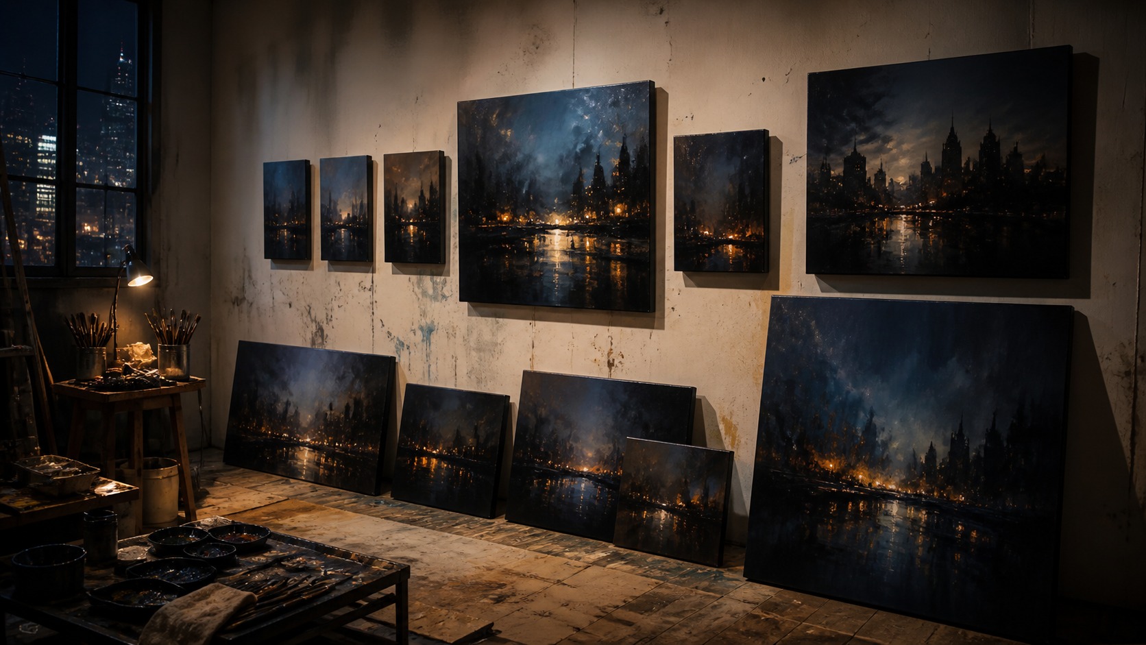
Scene matters because it gives the mood a place to live. Ocean calm suggests horizon, mist, pale reflection, and open breathing room, while urban nights suggest contrast, wet pavement, windows, and concentrated light. A dream-world collection might use strange scale, floating color, or softened edges. The imagined place helps the collection feel coherent without requiring every canvas to show the same subject.
Collectors should also decide what the mood is not. Ocean calm does not need every beach image, and an urban-night group does not need every skyline print. Excluding the wrong energy keeps the collection from becoming a loose category pile. Strong cohesion comes as much from refusal as selection.
Language can stay private, but it should be concrete. Write a one-sentence intention before buying or arranging anything: this wall should feel like walking beside dark water after sunset, or this room should feel like a slow morning in fog. A sentence like that catches mistakes quickly. If a canvas argues with the sentence, it probably belongs somewhere else.
Mood naming also protects the collection from trend drift. A popular color or fashionable subject may look tempting, but it can weaken the original atmosphere. When the mood has been named, the collection has a reason to stay disciplined. The result feels curated rather than accumulated.
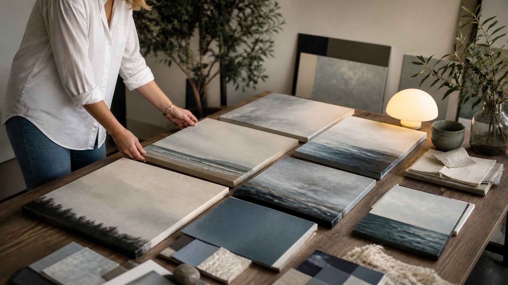
Mood boards can help, but they should not replace judgment. A board full of color swatches may look cohesive while the actual canvases disagree in scale, texture, or emotional weight. Place real images beside one another as soon as possible. Cohesion has to survive contact with the art itself.
Build a Shared Visual Vocabulary
Visual vocabulary is the set of recurring choices that lets different artworks speak together. It can include color temperature, contrast level, horizon placement, texture, subject distance, line direction, or finish. The goal is not to repeat everything. A good vocabulary gives variety a common accent.
Color usually becomes the most obvious connector. A collection based on ocean calm may use blue-gray, salt white, muted teal, and sanded neutrals, while an urban-night collection may lean into black, amber, steel blue, and reflected red. Those colors do not need to appear in equal amounts. A small repeated note can bind canvases more gracefully than a heavy-handed palette.
Contrast deserves equal attention. Mixing one very graphic canvas into a quiet tonal group can make it dominate the wall, even if the colors match. Likewise, a pale low-contrast piece may disappear inside a bold cinematic collection. Cohesion depends on value relationships as much as hue.
Surface texture can quietly unify the group. Canvas weave, matte finishes, visible brushwork, and softened photographic grain all affect how the pieces feel as objects. If one work is glossy and slick while the others are soft and tactile, the difference may distract. Production choices should support the emotional vocabulary.
Repeating composition habits can also help. Several works may share open skies, central paths, cropped architectural edges, or low horizons. These similarities let the viewer sense a family resemblance without needing exact duplicates. Composition is often where cohesion becomes visible from across the room.
Vocabulary should leave space for surprise. A collection that uses only the safest repeated elements can become flat. One piece might introduce a warmer accent, a denser texture, or a closer crop while still honoring the main mood. Controlled surprise keeps the collection alive.
Medium also affects vocabulary. A photographic seascape, painted abstract, and heavily textured print can share a mood, but they will not speak in the same visual accent unless finish and color are handled carefully. Mixed media collections need an extra check for surface behavior. The eye notices object differences even when the theme is clear.
Give Each Piece a Different Role
Every artwork in the collection should have a job. One canvas may establish the scene, another may deepen the color story, another may create movement, and another may offer quiet rest. Without roles, a collection can become several versions of the same thought. Role planning prevents decorative redundancy.
Anchor pieces carry the clearest statement of the mood. They are usually larger, more visually confident, or placed where the eye lands first. An ocean collection might use a wide horizon as the anchor, while an urban-night collection might use a rainlit street or luminous window grid. The anchor gives the wall its emotional thesis.
Supporting pieces should not behave like weaker anchors. Their purpose may be to soften, echo, extend, or contrast the main statement. A pale abstract canvas can give breathing room beside a detailed scene. A smaller close-up can let the viewer enter the mood through texture.
Transition pieces help the collection move from one area to another. They may bridge cool and warm colors, wide and close views, or calm and dramatic passages. This is especially useful on long walls, shelves, stairways, or rooms with multiple sightlines. Transitions make a collection feel composed rather than merely grouped.
Quiet pieces are often underrated. A restrained canvas can make the stronger works feel more intentional because it gives the eye somewhere to rest. Not every artwork needs to be the favorite. A good collection uses pacing, not constant emphasis.
Secondary pieces can carry the mood through detail. A small canvas showing foam, rain on glass, fabric shadow, or a close architectural fragment may make the larger scene feel more intimate. These pieces work because they deepen the world rather than changing the subject. Detail should feel like a doorway, not a detour.
Arrange the Collection Around How the Room Is Seen
Room flow should shape the arrangement. A collection seen from an entry needs a clear first read, while one discovered from a sofa can reward slower viewing. Walking paths, furniture height, window light, and doorways all affect how the group is experienced. The wall is not separate from the room's movement.
Sightlines can change which piece becomes the anchor. The largest canvas may not be the first one people see, and a small high-contrast work can steal attention from across the room. Stand at every normal viewing point before finalizing the order. Cohesion has to work in real space.
Spacing determines whether the collection reads as one thought. Tight spacing creates intimacy and continuity, while wider spacing lets each piece breathe. Inconsistent gaps can work only when they serve the mood and architecture. Most collections feel calmer when spacing follows a deliberate rhythm.
Furniture should be treated as part of the composition. A console, bed, sofa, dining table, or reading chair can visually gather the collection into one field. Center the group as a whole rather than treating every canvas as an isolated object. The room should frame the mood without swallowing it.
Lighting can either protect or distort cohesion. A warm lamp may flatter one print and make another look muddy; a cool bulb may sharpen one canvas while draining another. Review the entire group under day and evening light. A scene-inspired collection should keep its atmosphere across normal room changes.
Scale must suit both mood and distance. A dreamy quiet collection may benefit from generous empty space, while a cinematic night collection may tolerate closer grouping and stronger contrast. Large rooms can handle bolder anchors; small rooms often need cleaner pacing. The atmosphere should feel immersive, not crowded.
Open wall space is part of the arrangement. Leaving room around a quiet coastal group can make the whole room feel calmer, while compressing darker urban pieces can intensify the atmosphere. Empty space should be chosen with the same care as the canvases. The pause around the collection changes how the mood lands.
Edit Until the Collection Feels Inevitable
Editing is where cohesion becomes convincing. Remove one piece mentally and ask whether the collection loses a necessary note or simply becomes cleaner. If nothing meaningful disappears, that canvas may not belong in the group. A tighter collection usually feels more intentional.
Look for accidental repetition. Two similar horizons, two similar street scenes, or two similar cloud studies may compete even if both are beautiful. Keep the one that carries the mood more clearly or separate them with a different role. Cohesion should not become sameness.
Photographing the arrangement can reveal problems quickly. A phone photo flattens the wall enough to show whether one piece is too bright, too large, too busy, or too isolated. Designers often catch imbalance faster in a photograph than in the room. Use that distance before making holes permanent.
Titles and stories should not be needed to explain the set. The viewer may enjoy knowing the inspiration, but the collection should read visually first. If the group only makes sense after a long explanation, the visual vocabulary needs strengthening. Mood should be felt before it is described.
Final choices should feel calm after the novelty fades. A collection can be exciting on installation day and still prove too busy a week later. Live with temporary placements before committing when possible. The best scene-inspired collections keep deepening instead of shouting for attention.
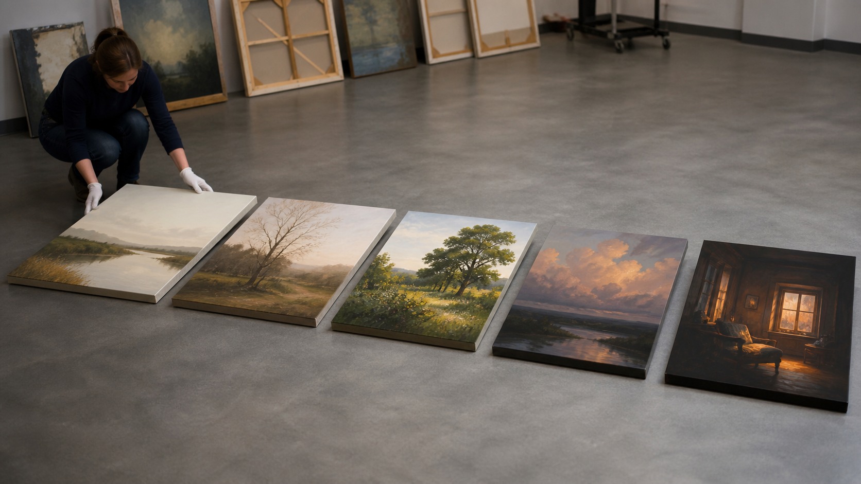
Comparison is most useful when the pieces are temporarily imperfect. Tape paper outlines, lean canvases on furniture, or arrange prints on the floor before judging the final wall. Imperfect mockups reveal whether the emotional relationship is strong enough to survive real installation. If the idea only works in a polished rendering, it may be fragile.
Let the Mood Guide Future Additions
A cohesive collection can grow, but growth needs discipline. Future additions should extend the original mood rather than restart the room every time a new canvas appears. Keep a note of the palette, contrast level, sizes, finishes, and emotional intention. That record makes later decisions easier.
Seasonal swaps can work when the core atmosphere remains stable. An ocean-calm room might move from misty winter water to brighter summer reflections without abandoning softness. An urban-night collection might trade one street scene for another with similar light behavior. The mood can evolve without losing identity.
Commissions should be briefed with the collection in mind. Share the mood sentence, existing palette, wall photos, and desired role for the new piece. Artists and print studios can make better decisions when they understand the whole environment. A custom work should join the conversation, not interrupt it.
Storage and rotation matter too. If pieces will be swapped, protect consistent framing, finish, and hanging hardware so the wall remains easy to refresh. A collection that is hard to manage may slowly lose its coherence. Practical systems help the mood last.
Ultimately, the collection succeeds when the room feels emotionally specific. Viewers may not know the planning words behind it, but they can sense that the pieces share a world. That felt unity is the reward. A single scene or mood becomes a complete visual atmosphere.
A collection note can prevent future confusion. Record the mood sentence, key colors, finish choices, and the reason each canvas belongs. This is not for display; it is a private map. Later, when a tempting new piece appears, the note can protect the room from drifting.
Small replacements should be tested against the whole group before they become permanent. A new canvas may match the palette and still change the mood's pace, especially if its contrast or texture is stronger than the others. View it beside the existing work in real light. Additions should feel like continuation, not interruption.