Visual Storytelling Comes from Sequence, Contrast, and Return
An art collection tells a visual story when the viewer can sense movement from one piece to the next. The story does not need characters, captions, or a literal beginning-middle-end plot; it can unfold through changing light, shifting scale, repeated shapes, emotional contrast, and a final image that makes the earlier pieces feel more meaningful. Collections fail as stories when every work competes for the same role or when the order feels accidental. A visual story works when each artwork changes what the viewer expects from the next one.
A: No, story can come from mood, light, contrast, sequence, and return.
A: Often it can, but room entry and sightlines may matter more.
A: Yes, when movement, color, rhythm, and transformation create a path.
A: Placement, scale, contrast, and clarity of mood usually do the work.
A: They help varied pieces feel connected without making them identical.
A: Yes, if that favorite weakens the story the wall is telling.
A: Return, arrival, transformation, or deliberate continuation can all work.
A: Ask fresh viewers where their eye begins, travels, and stops.
A: Yes, because it can make the wrong canvas dominate the sequence.
A: The viewer should feel carried from image to image with purpose.
Choose the Story Type
Start by deciding what kind of story the collection will tell. Some collections follow a place across time, others move from calm to intensity, and others compare different views of one subject. A story can also be emotional, such as solitude becoming connection or shadow giving way to light. The type of story determines the order.
Literal stories need clear continuity. A river, road, skyline, figure, season, or room can carry viewers from one canvas to another. Continuity helps the collection read quickly. Still, the sequence should avoid looking like a storyboard unless that is the intended effect.
Atmospheric stories work through feeling. A collection may begin with pale quiet, deepen into shadow, and finish with a warmer glow. Viewers follow the emotional weather even if the subjects change. This approach is useful for interiors because mood can guide the room without becoming too narrative.
Conceptual stories rely on contrast and return. A group might explore open versus enclosed space, natural versus urban forms, or memory versus present experience. The story emerges from relationships rather than plot. Each piece needs to sharpen the idea.
Personal stories should still read visually. Family memories, travel, or meaningful places can inspire a collection, but viewers should see the connection without needing every backstory. Use color, composition, and pacing to make the private story visible. Sentiment becomes stronger when design carries it.
Before selecting pieces, decide whether the story should feel linear, circular, or open-ended. A linear collection moves toward a clear destination, while a circular one returns to the opening idea in a changed way. Open-ended stories leave room for interpretation. Each structure asks for a different order.
Create a Clear First Read
Every visual story needs an entry point. The first piece may be the largest, lightest, darkest, most spacious, or most recognizable, but it should orient the viewer. If the opening is confusing, the rest of the collection has to work too hard. A good first read gives the eye a reason to continue.
Placement helps establish the opening. The viewer may read left to right, from the room entrance, from the center outward, or from the largest canvas first. Arrange according to how the room is actually experienced. A story on the wall should not fight the viewer's natural path.
The opening piece should introduce the visual vocabulary. It can establish palette, light direction, subject scale, texture, or rhythm. Later pieces can vary those elements because the viewer already knows the world. Without an opening language, variation feels random.
Overly dramatic openings can cause problems. If the first canvas contains the strongest contrast, brightest color, and densest detail, the following works may feel like decline. Sometimes a quieter start creates better momentum. Storytelling depends on pacing, not instant maximum impact.
Testing the first read is simple. Walk into the room and notice where the eye lands before thinking. Then ask whether that starting point is the one the story needs. If not, rearrange before changing the artwork itself.
Scale can reinforce the beginning. A larger entry piece often works, but a small luminous work can also pull viewers in when surrounded by quieter space. The opening does not have to dominate physically. It has to clarify emotionally.
Quiet openings can be powerful when the rest of the collection grows from them. A restrained first canvas gives later contrast more room to matter. It also asks viewers to slow down rather than consume the wall instantly. Subtle beginnings often create more elegant stories.
Use Contrast to Create Movement
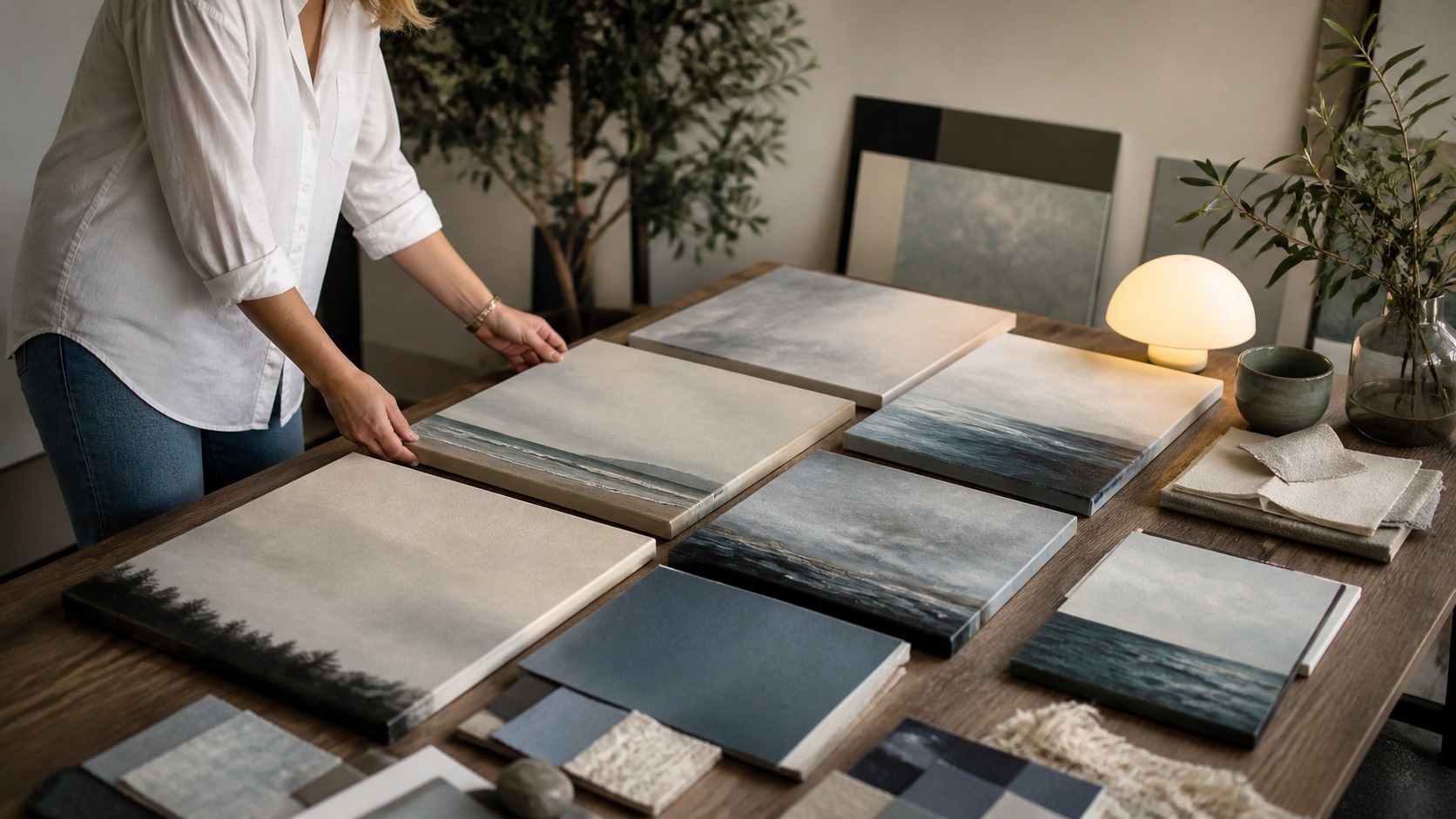
Movement appears when pieces differ in meaningful ways. Contrast can come from dark and light, open and dense, near and far, warm and cool, calm and active, or hard and soft edges. Without contrast, the collection may feel compatible but inert. A story needs change.
Contrast should be organized rather than scattered. A random bright canvas in a muted group feels disruptive; a bright canvas placed after several restrained works can feel like a reveal. Meaning depends on sequence. The same artwork can help or hurt depending on where it sits.
Color contrast can mark emotional shifts. Cool colors may create distance or reflection, while warm accents can introduce intimacy, tension, or arrival. A gradual shift often feels more story-like than a sudden jump. Abrupt color changes should have a clear narrative purpose.
Scale contrast affects pacing. Large canvases slow the viewer down and claim attention, while smaller works can feel like details, pauses, or memories. A collection of all large works can become exhausting. A collection of all small works may lack anchor points.
Texture contrast adds another layer. Smooth atmospheric pieces can sit beside rougher tactile pieces when the difference supports the story. The viewer feels the change physically before naming it. Surface variation can make a visual story more dimensional.
Emotional contrast is sometimes stronger than subject contrast. Two landscapes can feel completely different if one is airy and distant while another is enclosed and storm-dark. Viewers follow that feeling even when the category stays the same. Story movement often begins in tone.
Repeat Motifs So the Story Holds Together
Repetition keeps movement from turning into chaos. A recurring shape, color note, horizon, shadow direction, window form, figure posture, or brush texture can remind viewers that the pieces belong together. The motif does not need to be obvious. Subtle repetition often feels more sophisticated.
Motifs should evolve across the collection. A line might begin as a road, return as a table edge, and finish as a band of light. A warm accent might grow smaller as the mood quiets. Evolution makes repetition feel alive.
Too much repetition can flatten the story. If the same motif appears in the same place with the same weight in every canvas, viewers stop discovering it. Vary scale, position, clarity, or function. A motif should guide attention, not become a stamp.
Hidden motifs reward closer looking. A shared curve, recurring vertical rhythm, or repeated patch of color may not be noticed immediately, but it can make the collection feel connected over time. These quiet links are useful in homes because they do not demand constant attention. Good storytelling can be patient.
Production details can also become motifs. Matching canvas depth, matte finish, or edge treatment creates object-level continuity. This matters especially when subjects vary widely. The viewer senses one collected body of work.
Motif placement should be checked across the whole wall. If a repeated shape always appears at the same height, the collection may feel stiff. Moving the motif through different positions can create a sense of travel. Repetition becomes narrative when it changes jobs.
Negative space can become a storytelling tool. A wide pale canvas after several dense pieces may feel like release, while a compressed dark piece after open scenes may feel like pressure. Space tells viewers when to breathe. The absence of detail can move the story forward.
Give the Collection a Real Ending
Endings make collections feel intentional. The final piece might resolve the palette, return to the opening subject, introduce quiet, or leave the viewer with a deliberate question. An ending does not need to be final in a literal sense. It needs to feel chosen.
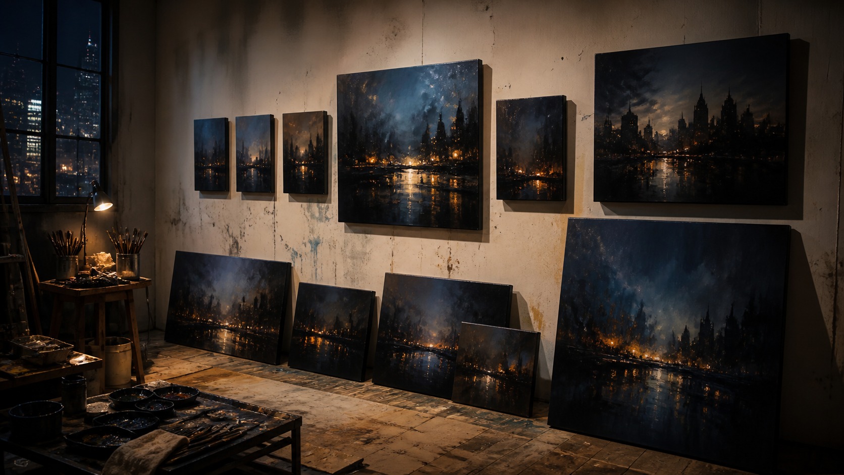
Strong endings often echo the beginning. A collection that starts with open water might end with a close reflection, or a city-night story might end with a single lit window. The echo gives viewers a feeling of return. Return is one of the simplest ways to create satisfaction.
Other endings move forward instead of circling back. A final canvas may be brighter, darker, larger, emptier, or more abstract than the first. This can suggest arrival, transformation, or continuation. The important point is that the change feels earned.
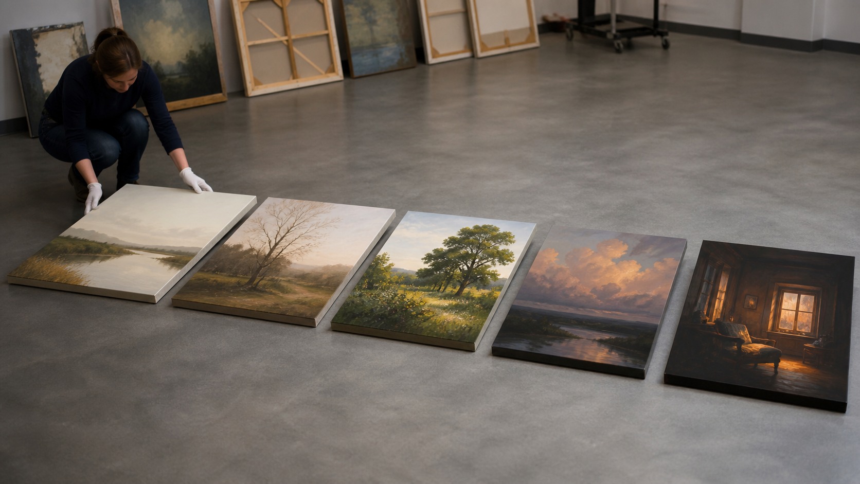
Avoid letting the ending be accidental. If the last piece is simply the one that fit the remaining space, the story may weaken at the finish line. Use templates or floor layouts to test several orders. A visual story deserves a considered last note.
Rooms with multiple viewing paths may need soft endings. A hallway, open-plan room, or staircase may be read from more than one direction. In those cases, the collection can use two entry points and a central turning point. Story order should adapt to the architecture.
Final impressions matter because they color the whole group. A confusing ending can make earlier pieces feel less purposeful, while a strong ending makes the sequence feel retrospectively clear. The last canvas teaches viewers how to remember the collection. That memory is part of the story.
Alternative endings are worth testing. Swap the final two pieces, move the darkest work to the center, or let the quietest canvas close the sequence. The best ending often becomes obvious only after several arrangements. A visual story deserves rehearsal.
Memory is another ending test. Look away from the wall and notice what remains in your mind: a color path, a final glow, a repeated line, or a feeling of arrival. If nothing holds, the ending may need more clarity. The viewer's memory is part of the composition.
Review the Story as a Whole
Reviewing the whole collection prevents isolated decision-making. A canvas that looks excellent alone may interrupt the story when placed in sequence. Judge pieces by contribution, not only beauty. The wall story is stronger than any one favorite.
Distance tests reveal structure. Step back until details soften and ask whether the collection still has a beginning, development, and ending. If it becomes a row of unrelated images, strengthen the motif or order. If it becomes repetitive, increase contrast.
Fresh viewers can expose weak transitions. Ask where their eye starts, where it moves, and which piece feels like the ending. Their answers may show whether your intended story is visible. Good visual storytelling does not require a lecture.
Lighting should be checked after the order is set. Uneven glare or bright spots can change the story by making the wrong canvas dominant. Adjust lamps, curtains, or placement before assuming the sequence is flawed. The display environment edits the story too.
Ultimately, the collection succeeds when the viewer feels carried. They may pause at individual works, but the relationship between pieces gives the wall momentum. That movement can be quiet, dramatic, personal, or atmospheric. A visual story is a path made from images.
Documentation helps the story remain intact. Record the order, spacing, lighting conditions, and reason for each placement. If the collection is moved later, those notes protect the sequence. A visual story can be portable when its logic is clear.