Good Lighting Lets Canvas Art Look Intentional After Sunset
The best lighting for canvas prints does more than make the wall brighter. It reveals texture, protects color, reduces glare, and helps the artwork hold its mood in the room where people actually live. A canvas that looks beautiful in daylight can fall flat at night if the light is too weak, too warm, too harsh, or aimed from the wrong angle. With a few smart choices, home lighting can make canvas art feel richer without turning the room into a gallery showroom.
A: Add a dimmable accent source aimed carefully at the canvas.
A: They are useful, but track lights or lamps may work better in some rooms.
A: Warm-neutral is often safest, but test it with the artwork's palette.
A: A lamp or fixture is likely reflecting from your viewing position.
A: Yes. Angled light can show weave and depth beautifully.
A: Quality LEDs are generally cooler and safer than hot halogen bulbs.
A: Only if the beam spreads evenly across the whole artwork.
A: Avoid direct sun, excessive heat, and unnecessarily bright exposure.
A: Yes, when accent light creates hierarchy without glare.
A: Stand where viewers sit, then adjust angle, brightness, and color temperature.
Start with the Room, Not the Fixture
Before choosing a picture light or bulb, look at the room's existing light. Windows, lamps, ceiling fixtures, wall color, and nearby furniture all affect how the canvas reads. A print above a sofa needs different lighting than one in a hallway or dining nook. The best solution works with the room instead of fighting it.
Think about when the artwork matters most. If the room is used mainly in the evening, warm layered light may be more important than perfect daylight accuracy. If the print anchors a bright living room, glare control may be the priority. Lighting should match the habits of the space.
Wall color changes how lighting feels. A dark wall may make a canvas look more dramatic with less light, while a pale wall can reflect brightness back into the room and reduce contrast. The fixture does not work alone. It interacts with paint, furniture, windows, and the artwork's own palette.
The room also deserves a vote. A canvas print is not judged in a neutral laboratory after it is installed; it is judged beside furniture, wall color, windows, lamps, and daily habits. Planning best lighting for canvas prints: how to make your art pop at home around the final environment keeps the finished piece from looking technically correct but emotionally wrong.
Small decisions compound quickly in canvas printing. A slightly warmer fabric, a glossier finish, a brighter bulb, or a looser weave may seem minor alone. Together they can change the entire mood of the print. That is why experienced buyers slow down before approving the final version.
The most useful decisions are the ones tied to a specific artwork. A moody landscape, a bright abstract, a family portrait, and a clean architectural photograph each ask for different priorities. Treating them as different problems leads to better canvas prints than applying one universal rule.
Use Angled Light to Reveal Texture
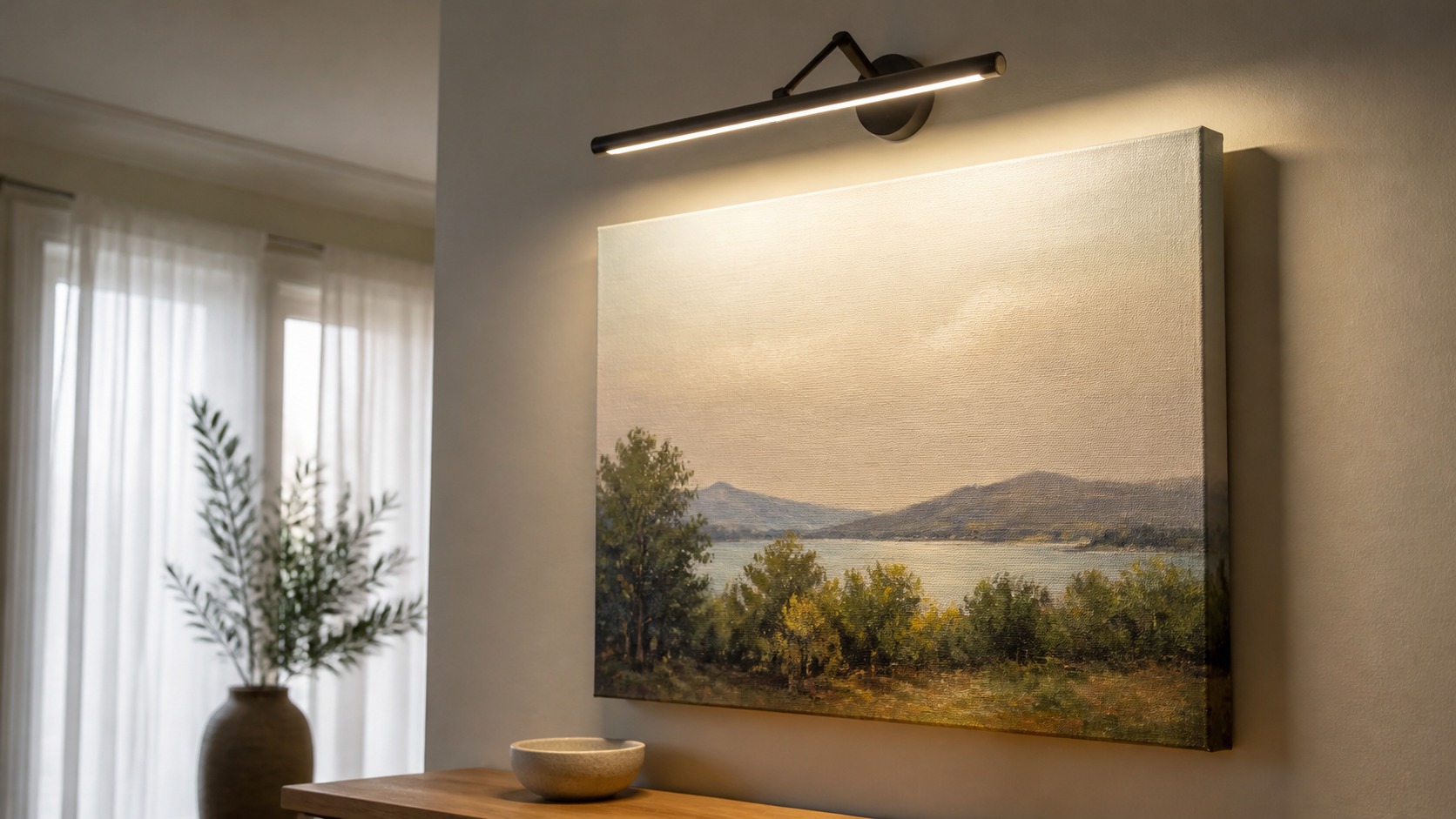
Canvas has a woven surface, and angled light can make that texture visible. A light placed slightly above and in front of the artwork often reveals depth without washing the image flat. Too steep an angle may create harsh shadows across the weave, while light aimed straight on can produce glare. Small adjustments make a large difference.
Picture lights, adjustable track heads, and directional wall washers can all work when aimed carefully. The goal is even illumination across the print, not a bright stripe at the top and darkness at the bottom. Large canvases may need wider spread or multiple sources. A single narrow beam can make an oversized piece look uneven.
Test at night before committing. Move a lamp, adjust a dimmer, or temporarily aim a fixture to see how the canvas reacts. The surface will quickly show whether the angle flatters the artwork or exaggerates reflections.
The size of the canvas affects the lighting plan. A small piece can often be handled with one picture light or nearby lamp, but an oversized print may need wider, softer illumination. If the top of the print glows while the bottom falls into shadow, the artwork will feel unfinished even if the fixture is attractive.
Professional results often come from narrowing the question. Instead of asking which option is best in general, ask which option protects the artwork's strongest feature. If the strongest feature is subtle color, protect color. If it is surface depth, protect texture. If it is long display life, protect the material system.
The practical rule is simple: inspect the material, confirm the image, and imagine the room before production is final. That sequence catches most avoidable disappointments. It also keeps the finished canvas aligned with the reason someone wanted the artwork in the first place.
Good production also leaves room for restraint. It is tempting to choose the brightest color, strongest texture, glossiest finish, or most dramatic lighting because it seems premium. In practice, the best choice is often the one that supports the image without drawing attention away from it.
Choose Color Temperature with the Artwork in Mind
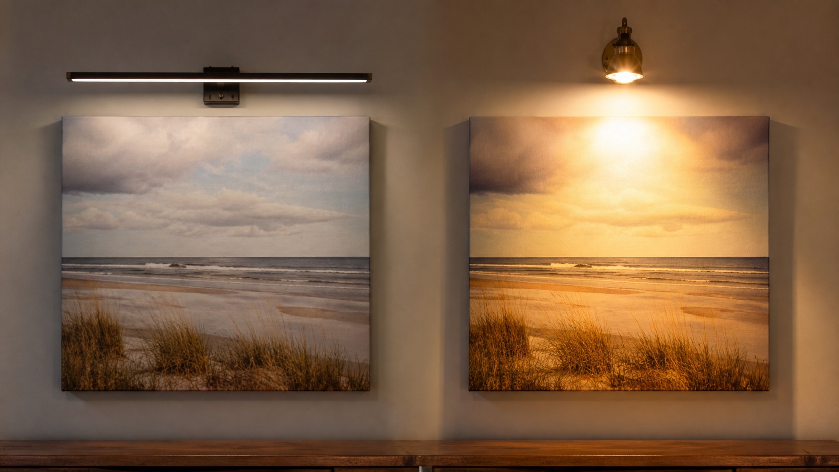
Warm light can make interiors feel comfortable, but it can also push whites, sand tones, and skin tones yellow. Cooler light can keep blues and grays clean, but it may make a cozy room feel clinical. For most homes, a balanced warm-neutral bulb gives canvas art a pleasant look without distorting color too heavily. The artwork's palette should guide the choice.
Color rendering matters as much as temperature. A bulb with poor color rendering can make reds, greens, and subtle neutrals look lifeless. Look for high-quality bulbs intended for art, retail, or photography-like color fidelity. Better light often improves a print more than a brighter light.
Color temperature should be tested with the actual print. Warm light may enrich a sunset or portrait, but it can make cool abstracts and black-and-white photography look muddy. Cooler light can preserve blues and grays, yet feel harsh in a cozy room. The best bulb is the one that honors both the art and the space.
That is why samples, proofs, and clear production notes are so useful. They turn vague preference into evidence. A buyer can see how the canvas responds, a printer can make smaller corrections, and the final artwork has a better chance of feeling deliberate once it reaches the wall.
A final approval should feel calm. When the file, proof, material, finish, and room all point in the same direction, there is less temptation to keep correcting. The canvas can then be produced with confidence instead of hope.
For buyers, the simplest protection is curiosity. Ask what material is being used, how it behaves, how it will be finished, and how it should be displayed. Clear answers turn a canvas order from a guess into a guided decision.
Control Glare Before Increasing Brightness
When a canvas looks dull, the instinct is to add more light. Sometimes the real problem is glare. A satin or coated surface can reflect a lamp, window, or ceiling fixture directly back at the viewer. More brightness may only make the reflection stronger.
Change the angle first. Shift the fixture, move a lamp, use a shade, or reduce competing light from windows. Matte canvas is more forgiving, but even matte surfaces can show sheen under harsh directional light. The cleanest lighting makes the image visible without making the surface announce itself.
Dimmers are helpful because art lighting rarely needs full power all the time. A lower setting can preserve mood while still giving the canvas enough presence. This is especially useful in bedrooms, dining rooms, and evening living spaces.
Glare often appears from the viewer's position, not from the wall. Stand where people normally sit or enter the room and look for reflections across the canvas. A fixture that seems fine up close may produce a bright streak from the sofa. Adjusting angle and height usually solves more than buying a brighter bulb.
The best outcome is a canvas that does not call attention to the production decision. Viewers should notice the artwork first, then sense that the surface, color, and display choices feel right. When that happens, the technical work has done its job quietly.
That confidence is the real purpose of matching.
That care shows when the print is finally installed. The artwork feels settled, the surface feels appropriate, and the room supports the image instead of exposing production compromises.
Protect Color While Displaying It Well
Light helps people enjoy art, but intense exposure can age prints over time. Avoid long hours of direct sun, especially on saturated or sentimental canvas pieces. Use window treatments, indirect placement, and sensible artificial light to balance visibility with preservation. A beautiful display should not shorten the life of the print unnecessarily.
Modern LED lighting is usually a practical choice because it produces less heat than older halogen options. Choose quality bulbs, avoid placing fixtures too close to the canvas, and keep the surface away from hot lamps. The aim is comfortable illumination, not theatrical heat. Good lighting should be gentle as well as flattering.
Good lighting should feel effortless. Visitors should notice the art, not the equipment. When accent light, ambient light, and natural light are balanced, the canvas gains presence without looking staged. That is the sweet spot for home display.
A careful review should include the front of the canvas, the side edge, and the way the piece looks from the main entrance to the room. These viewpoints reveal different issues. The front shows color and composition, the side shows construction and finish, and the entrance view shows whether the artwork has the right presence.
It keeps the final print grounded.
Layer Lighting for a Finished Look
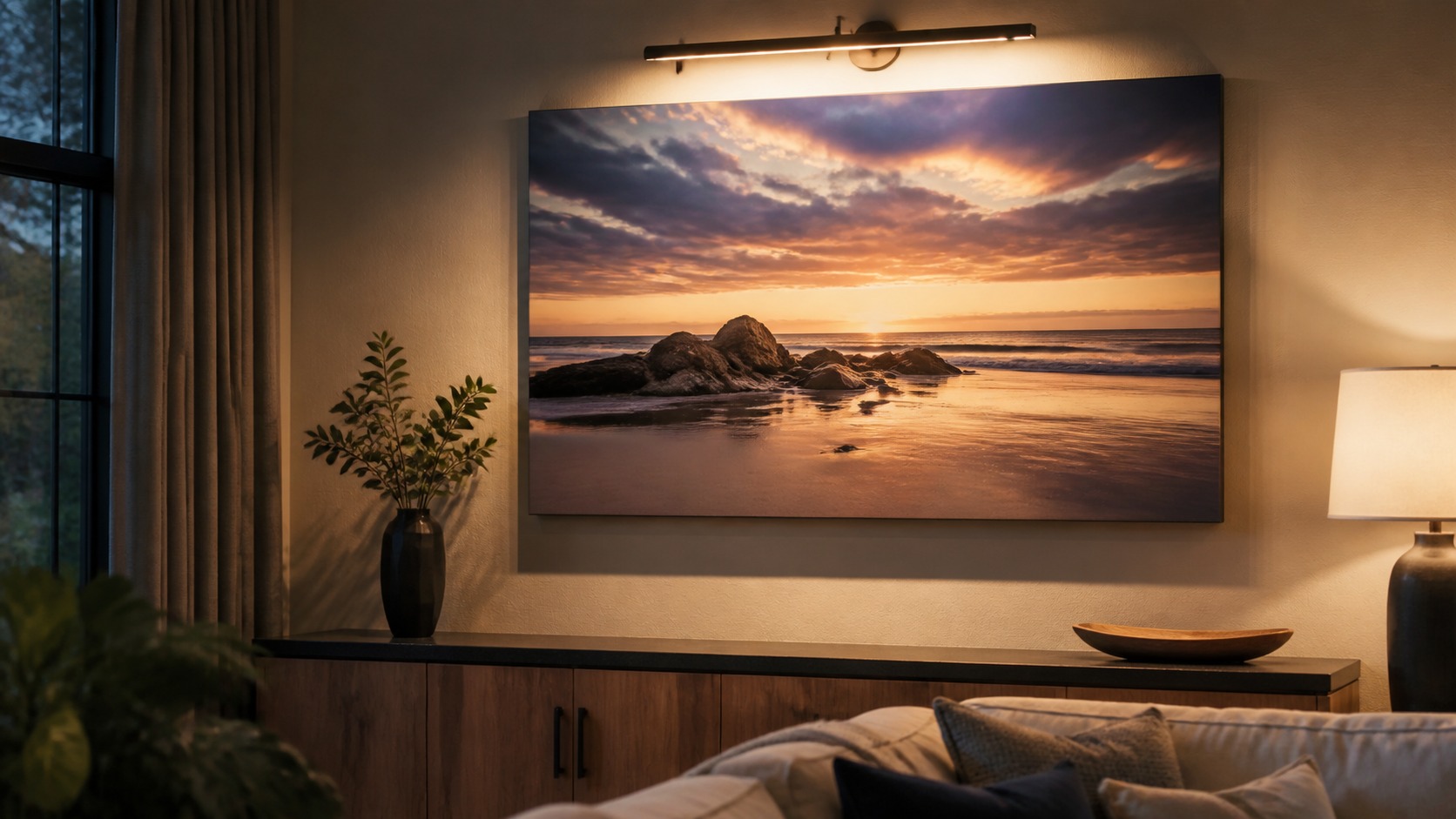
Canvas art looks best when it participates in a layered room. Ambient light sets the general mood, accent light gives the artwork presence, and nearby lamps soften the contrast. If the canvas is the only bright object on a dark wall, it can feel isolated. If everything is equally bright, the art loses focus.
A picture light above the frame, a shaded lamp nearby, and dimmable ceiling light can work together beautifully. The exact combination depends on room size, wall color, and artwork scale. What matters is hierarchy: the print should be noticed without overpowering the room. That is how art pops in a home rather than just shining under a fixture.
Once the balance is right, the canvas will change throughout the day in a pleasing way. Morning light, evening lamps, and dimmed nighttime settings can each reveal a different side of the same piece. That living quality is one of the pleasures of canvas art, and lighting is what lets it happen.
For this specific subject, the safest choice is to make the decision in stages rather than trusting a single preview. Best Lighting for Canvas Prints: How to Make Your Art Pop at Home becomes easier to manage when the buyer compares samples, asks how the material behaves, and judges the result from normal viewing distance. That slower process catches problems that a quick online approval usually misses.
It also helps to compare choices against the purpose of the print. A sentimental family image, a decorative seasonal piece, an artist edition, and a large room anchor do not need the same level of control. Spending effort where the artwork carries real value makes the process feel sensible rather than excessive.
A second review pass should focus on what changed after the image became physical. Canvas has thickness, texture, edge depth, and a relationship to surrounding light that no flat preview can fully communicate. Looking for those changes before final approval helps the finished piece feel deliberate rather than merely acceptable.